Dear Friends,
Ambiguous Zones 8 takes a close look at Non-gravitational Being, 1983-84, a large-scale painting by Arakawa. This artwork offers a short text on Arakawa and Gins’s concept of “Blank” and stands as a good introduction to the work being done by Arakawa in the early 1980s. A short formal analysis of the painting will leave you primed to meditate on the artist’s ideas about spacetime, energy-matter, and how gravity might work in different dimensions. Hopefully you will enjoy this brief contemplation on physics all the more knowing that scientists were wrong, luckily, in their prediction that asteroid 2009 JF1 would hit the Earth on May 6th, 2022!
Yours in the reversible destiny mode,
Reversible Destiny Foundation and ARAKAWA+GINS Tokyo Office
Non-gravitational Being, 1983-84: A Meditation
by Amara Magloughlin
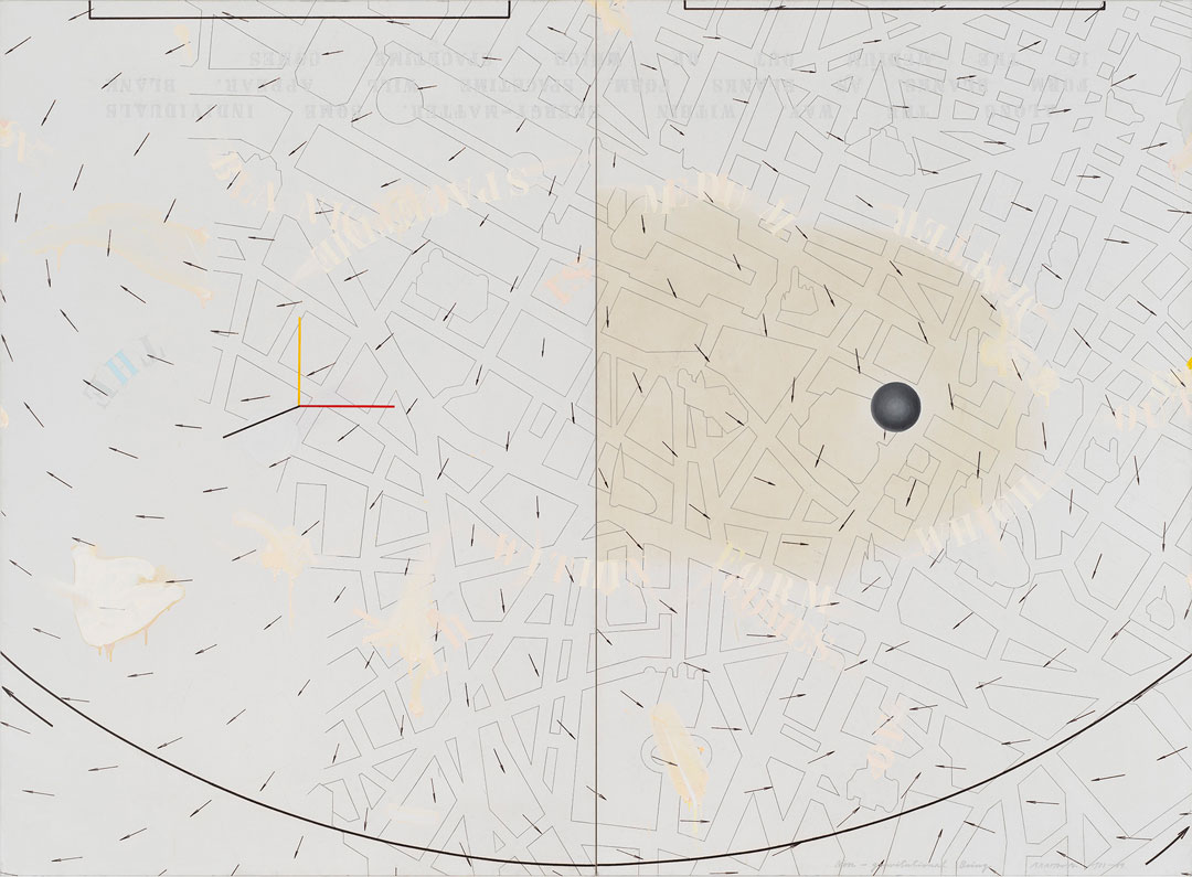
Arakawa’s painting, Non-gravitational Being, 1983-84, sets up the viewer to encounter a large-scale map covered with arrows pointing in different directions in a pattern reminiscent of air currents. The far-left side of the map appears to be incomplete, but is it unfinished? Has it been erased in some way? Perhaps the mapmaker was not able to fill the rest of the canvas out of ignorance of what should be there, or perhaps the area has yet to be charted. There are endless possibilities including the fact that they may have interrupted an event in mid-flow or that the painting is waiting to be activated by the viewer to finish its development, just as the viewer will in turn develop alongside or with the painting. At 100 x 136 inches, the size of the canvas overwhelms the viewer, perhaps making them feel dislocated rather than better able to find their way as a map ought to do. This immersive inarticulation serves to prolong the moment of proto-perception that interested Arakawa so much. In his own words, he wanted to paint “the condition that precedes the moment in which the imagination goes to work and produces mental representations.”¹ It is possible that this is represented on the canvas, but in this instance, Arakawa has worked to lengthen this effect in the viewer—both artwork and viewer need the other for activation.
The various elements in the painting appear to occupy parallel planes, of which I count at least five. The map is the furthest back on the fifth plane, which includes the yellowed varnished area. The fourth plane has text stenciled across it in a seemingly sporadic manner with equally sporadic splotches and drips of paint. This plane also contains a white circle faintly visible beneath the black line of the three-pronged symbol (which will be mentioned below) on the left panel, as well as text stenciled upside-down at the top of the canvas. The third plane is occupied by arrows circulating over these phrases. The second plane holds the black, yellow, and red lines that form a sort of axis and the dark grey sphere. To my eye, the curved line circumscribing the bottom of the canvas, the two bolder directional arrows that perhaps indicate movement in opposite directions along this line, and the rectilinear shapes that move off the top of the canvas seem to exist on the first plane closest to the viewer.
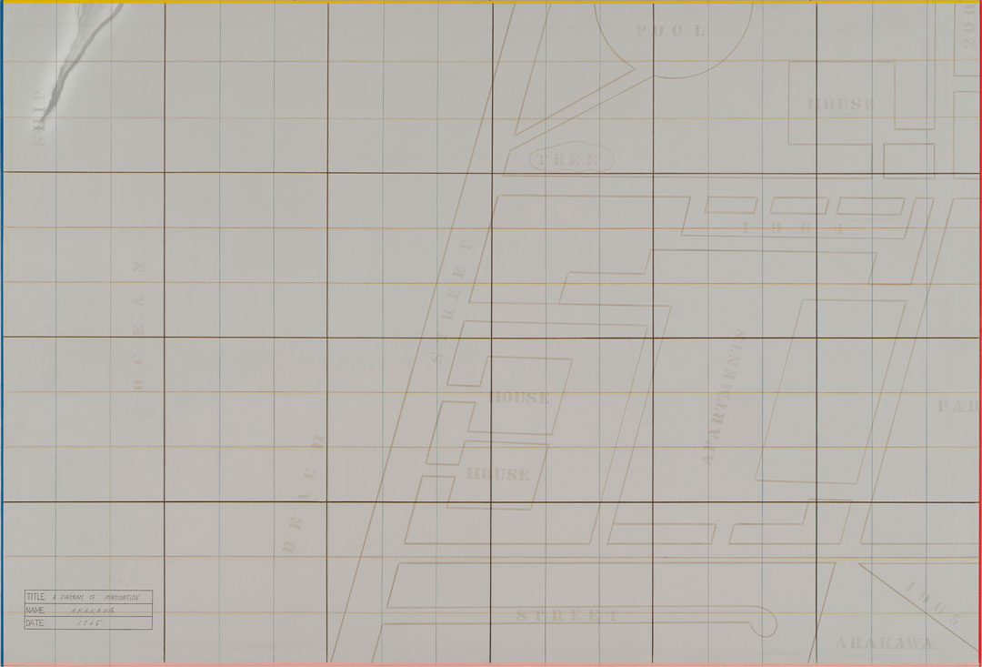
It would be difficult to develop an interpretation for this painting without examining other works by Arakawa with similar motifs and more snippets of text, both of which serve to elucidate Arakawa’s philosophical thought. Arakawa’s earlier diagram paintings include examples of maps with labels indicating certain elements, like STREET or OCEAN, as seen in A Diagram of Imagination, 1965. In the early 1980s, instead of these labels we find maps with elevations of tourist attractions locating objects in space. This is simply a different kind of sign, and one that is instantly recognizable as belonging to a tourist map. The iconic shapes of these buildings are as recognizable as their written names to the local population. For an international audience, such elevations might be more useful in deciding whether they have reached the right spot. In any event, this two-dimensional representation of space includes a nod to the three-dimensional world with the spare elevations of monuments that speak to the national identity of the inhabitants of this city. Indeed, they are so recognizable that with close inspection the viewer may begin to be able to identify what they are looking at. The Cathédrale de Notre-Dame de Paris is particularly iconic in shape and given its position near the dark grey sphere, it might be one of the first buildings that the viewer notices. Moving along the Seine to the left, the Louvre and the Jardin des Tuileries become apparent. Below this, the Palais du Luxembourg and the Panthéon among others are also identifiable. Even though we now feel we are in Paris, the city itself is interchangeable for the meaning of the painting. Since we have not yet found the map that Arakawa used to make this painting, it is not clear if he changed the streets in any way. Tourist maps are notorious for simplifying the street map, narrowing their usefulness to locating highlighted landmarks and sometimes not even those.
The sentences stenciled across the top of the two panels read as follows: “ALONG THE WAY, WITHIN ENERGY-MATTER, SOME INDIVIDUALS / FORM BLANKS. AS BLANKS FORM, SPACETIME WILL APPEAR. BLANK / IS THE MEDIUM OUT OF WHICH SPACETIME COMES”. While this text appears upside-down at the top of the canvas, some of the same words float randomly across its surface. Are we meant to see these as “non-gravitational beings”? They do not appear to correspond to anything on the map, but they do seem to align themselves around the contours of the varnished, yellowed section of the right panel. Is this indicating a different texture or density within spacetime that the words are reacting to or affected by even while they are not affected by gravity? They float outside of the structure of the sentence, which is nonetheless provided to the viewer, though in a way that may cause some disorientation. Which way is up becomes hard to say categorically, especially when dealing in beings not governed by gravity. Sentences like these that expound upon “Forming Blank” are found in many other paintings from around this time. Taken together, they lend extra insight into the ways in which this work may be read. The same can be said for the next plane, with arrows being one of the most commonly recurring motifs in Arakawa’s work. The arrows also have to do with Blank and its forming. This will be explored more deeply in a forthcoming article. For now, one interpretation might be that energy-matter, perhaps starting from the dense sphere, generates the forming of blanks out of which unfolds spacetime, as indicated by the arrows.
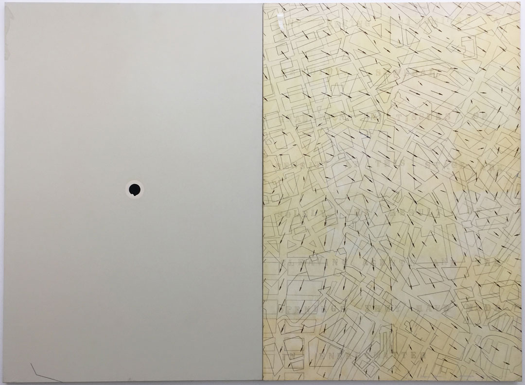
This dense, dark grey sphere on the right panel is worth looking at more closely. It is similar to the imperfect flat black circle on the left-hand panel in Arakawa’s painting, Proper Noun, 1983-84. In that instance, if we are to accept Gins’s interpretation of this painting in Helen Keller or Arakawa, 1994, that the map, representing spacetime, unfolded from this circle, Arakawa has presented a sequence for the event represented: on the left-hand side of the panel the unfolding has not yet taken place, so the dot holds every potential happening. By the time of the right-hand panel, the dense energy-matter has unfolded and has been cleaved, resulting in openings and variation in tissues of density, which can perhaps be seen in the hazy white patches on the right panel. It is a flat, two-dimensional circle, but if the energy-matter inside is condensed, then perhaps its dimensional existence can be condensed as well, as in the case, potentially, of a black hole. If we understand the same unfolding of energy-matter to be taking place in Non-gravitational Being, then we must also forgo any sense of a sequence of events, since both the sphere and the unfolded spacetime are represented, though possibly on different dimensions. If the unfolding only truly begins to take place with the viewer present to activate it, then in some senses this sphere does act as a “YOU ARE HERE” dot—though it is not necessarily locating the viewer literally on the Île de la Cité. This does not negate the possibility that the viewer IS there, especially given that Arakawa appears to be dealing in different dimensions.
Moving to the left panel, it is harder to find a precedent for the three intersecting lines in other paintings showing maps. Perhaps this black, yellow, and red symbol is meant to indicate the Cartesian coordinate system, with three axes meeting at the point of origin, here representing three-dimensional space (width, length, and height). This is not to limit the dimensions in Arakawa’s painting to three. It seems likely that Arakawa is including density and texture as other calculable dimensions, an idea borne out by other paintings, and, if so, the three intersecting lines may represent something slightly different. Nevertheless, let’s accept for a moment that in Non-gravitational Being the Cartesian axes denote three-dimensional space. If this is the case, then the arrows could be read as time, representing the fourth dimension. In this scenario, time is not behaving in the way we are used to perceiving it, since it is moving in many directions. We are in a world created by the canvas and the rules are Arakawa’s, so while time can behave in anyway the artist sees fit, it seems more plausible that in Arakawa’s configuration of elements the arrows indicate the unfolding of spacetime, as previously theorized. Moving to the sphere, it can be seen as being comprehensive of more than three dimensions whether condensed or not. Regardless, the first and closest plane in relation to the viewer, with its curve at the bottom of the canvas may represent four dimensions as curved space.
When all elements are taken in together, the viewer most likely does not feel like they have been transported to Paris, so this is not an effective stand-in for a landscape painting. Instead, the viewer might begin to understand how spacetime and Blank relate during this unique act of perception. The viewer might not yet be at the stage in which they perceive themselves as Blank, but there are many other paintings and encounters staged by Arakawa that will get them there. For now, it is enough to understand that energy-matter can have different densities and textures and that this will affect the ways in which perceiving beings experience spacetime as it unfolds. These ideas will be explored further in a forthcoming article.
¹Charles Haxthausen, “Diagrams for the Imagination,” in Arakawa: Diagrams for the Imagination, ed. Ealan Wingate (New York: Gagosian, 2019), 13. In the corresponding endnote, Haxthausen states that this is his own “translation from the Dutch of what was clearly a Dutch translation from the Japanese” found in: Yoshiaki Tono, “Het schilderen van Shusaku Arakawa: een voorstadium van de verbeelding,” Arakawa, exh. cat. (Eindhoven: Stedelijk van Abbemuseum, 1966), n.p.