Categories
front page Newsletter

Ambiguous Zones, 12

Dear Friends,

The new year brings with it the twelfth edition of our Ambiguous Zones newsletter, written by guest author Chaeeun Lee who thoughtfully considers Arakawa and Madeline Gins’s concept of Blank. Chaeeun is a PhD Candidate in Art History at CUNY Graduate Center and a research intern at the Reversible Destiny Foundation. She is writing her dissertation on the politics of abstraction and aesthetics in the work of Asian American and Asian immigrant artists during the 1960s and the 1970s, exploring the ways in which their work problematized the established norms of racial, cultural, and gender identification in search of alternative constructions of the self and the world.  Chaeeun’s beautiful essay offers readers an accessible introduction to Blank that serves as a novel way to meditate on seasonal themes of fresh starts and shifting perspectives.

Yours in the reversible destiny mode,
Reversible Destiny Foundation and the ARAKAWA+GINS Tokyo Office

“LOUDLY THERE AND SHIFTING ABOUT AND TUMBLING INTO VIEW”: TRACING BLANK IN THE WORK OF ARAKAWA AND MADELINE GINS, 1968-1982

by Chaeeun Lee

Figure 1. Arakawa, Study for “Shifting Blank,” 1979. Acrylic and graphite on lithograph and paper, 42 1/2 x 59 7/8 in. (108 x 152.1 cm).

In Arakawa’s Study for “Shifting Blank,” a legion of tiny arrows forms layers of swirling patterns that fill the entirety of the canvas. In the background is a diagram of a city map, overlaid with a block of text on a neutral-toned ground (fig. 1). The work is part of a body of drawings and paintings created circa 1980 that drew on the term Blank, which began to appear frequently in Arakawa and Gins’s work starting in the mid-1970s. Contrary to the term’s implication of absence, the multidirectional arrows seem to indicate an abundance of movement and energy that overflows the boundaries of the city, rendering their Blank paradoxically full.

Figure 2. Arakawa, Blank, 1968. Acrylic, graphite and art marker on graph paper, 34 x 26 in. (86.4 x 66 cm).

The history of Arakawa and Madeline Gins’s engagement with Blank may be traced to the 1960s, evidencing the centrality of this concept to their broader artistic and intellectual journey. A drawing by Arakawa titled Blank (1968) presents the viewer with two blank check boxes labeled “YES” and “NO” along with an unexpectedly simple question that debunks the pretense of objectivity in art appreciation, “Do you like this painting?” (fig. 2). In the spring of the following year, Arakawa and Gins participated in “Street Works,” a series of happenings by artists and poets convened by Vito Acconci and Bernadette Mayer. During the event, Gins handed out to passersby a questionnaire full of blanks to be filled in and mailed back to her, which would become part of “a group novel” that would explore “the nature of consciousness”[1] (fig. 3). What at first sight looks like an ordinary questionnaire asking for the responder’s name and age quickly reveals itself as a series of provocations that compel radically unorthodox manners of self-reflection. Midway through the text reads:

I move according to ____________________________. I am composed of ____________________________ and _________________. This falls into _____ parts. The heaviest part to move is ______________.

I felt my thoughts to physically be in (out) ___________________________ (Be Specific). The material of which they are made is _________________ which operates ___________________________.

Here, the blanks stir up an inquisitive attitude directed toward our existence and functioning as humans, which we are habituated to perceive as given or unknowable: What moves us (physically or emotionally)? What are we made up of (biologically or spiritually)? Where do our thoughts reside, and how do we feel their presence? The open-ended nature of the blanks and the unconventional angle of approach evidenced by Gins’s sentence fragments invite a myriad of creative answers to these questions, a good example of which is the whimsical, somewhat comical, response she received from Robert Cordier (fig. 3). In these early experiments by Arakawa and Gins, blanks appear literally as unmarked boxes or holes in sentences that are constituent parts of their works. Urging the audience’s response yet not so easy to fill in, the blanks function as a questioning device in the manner of the interactive, game-like panels in The Mechanism of Meaning (1963-71), which was at the time a work-in-progress.[2]

Figure 3. Madeline Gins, Untitled, connected to the Street Works edition of 0 TO 9, edited by Vito Acconci and Bernadette Mayer, 1969, mailed-back response by Robert Cordier, typescript, 1969, Box 2A05, Folder 2, Reversible Destiny Foundation Archives.

Between 1973 and 1980, Arakawa and Gins’s inquiry into the Blank sharpened through a compound word “point-blank.” In Arakawa’s 1973–74 painting Point Blank, densely arrayed beams emanate from six cylindrical forms[3] located along the sides of the canvas, rendered in primary colors and in grayscale (fig. 4). Behind the intersecting lines that spread through the entire field, the following text is stenciled in white: “POINT BLANK: / DISTANCE OF FOCUS, / HOW ANONYMOUS IS / THIS DISTANCE / WHICH IS A TEXTURE.” As is the case with many of the couple’s invented aphorisms, the meaning of the text is not instantly decipherable. Yet what is clear in its repeated invocation of the distance of point-blank is an interest in challenging the perceived immediacy associated with the term—what mysteries and complexities might lie in the space between the main actor and the target, no matter how close they seem to be? This is further confirmed in the preface to the 1979 edition of The Mechanism of Meaning, in which Arakawa and Gins clarify their aims to investigate “what takes place . . . when anything is ‘thought through.’”[4] “What is emitted point-blank at a moment of thought, anyway?” ask the artists, seeking to scrutinize the seemingly instantaneous mental process we call “thinking.”[5]

Figure 4. Arakawa, Point Blank, 1973–74. Acrylic and maker pen on canvas, 48 x 70 in. (121.9 x 177.8 cm).

An unpublished sketch by Arakawa evinces that his focus was already moving on to the concept of “blank” itself by 1975 (fig. 5). On both the front and back of the paper, Arakawa drew spinning conical forms from which numerous lines extend out, a variation, it seems, on the cylinders from Point Blank (1973–74). Underneath one of the drawings he scribbled the following: “Who is sending blank?!! / Mystery which comes through clarification / Lines cannot contain moment of representation / Possibility of experience.” In some of his later works, such as Distance of Forming/Model by Model/The (1978–79) and Voice Drinker / The Artificial Given (1978–79), Arakawa implemented the motif of spinning cones in a more complex form while raising the question of “who” in a still enigmatic manner (a line from the stenciled text goes “BOTH SENDERS AND RECEIVERS CONFIGURATIONAL COVERINGS . . . ”) (fig. 6). Moreover, his notes provide a glimpse of the continuity in his conceptualization of Blank—that Blank is what is uncharted (mysterious) and filled with possibilities, and that knowing this unknowability is itself a form of enlightenment (clarification).

Figure 5. Arakawa, Unidentified (Who is sending Blank?!!), 1975. Pencil on paper, 13 1/2 x 21 in. (34.3 x 53.3 cm).
Figure 6. Arakawa, VOICE DRINKER / THE ARTIFICIAL GIVEN, 1978–79. Acrylic on canvas, 72 13/16 x 120 1/16 in. (185 x 305 cm).

One of the major documents on Blank in its mature stage of development is the 252nd issue of Derrière le Miroir (1982), the French art magazine founded by gallerist Aimé Maeght. Published on the occasion of Arakawa’s solo show at Galerie Maeght, the issue contains a short text by Arakawa and Gins titled “Properties of Blank” along with nine full-page reproductions of Arakawa’s recent paintings and drawings. A sort of treatise on Blank, the text seeks to explicate the concept, describing it as an “area” or “activities” therein that are “non-activated,” “unspecified,” and “capable of behaving in many different ways at once,” and are integral to our subjectivity as a “neutralizing” or “changing” force.[6] In other words, Blank is an open-ended sphere of activity that is already part of us, which has a potential to upturn what we perceive as given ways of thinking, feeling, and acting. As such, Blank is distinguished from any implication of nonbeing, as the authors make it clear through a series of comparative exercises.

Void, Nothingness, Emptiness, Tabula Rasa, Vacuum. None of these quite covers what we wish to point out by the notion “Blank.”

First of all, Blank is above all a neutral positing—in the sense of a holding open; it is what is there but undifferentiated, so it is not nothing; it can accumulate: it is not void. It probably has its own laws of operation, so it, itself, is not a “tabula rasa.” It is what fills Emptiness. It may draw upon or feed whatever it is the vacuum is but is not identical with it.[7]

Interestingly, the text is followed by a string of excerpts from a variety of thinkers, writers, and scholars from across time and regions, ranging from Aristotle to Laozi, and from Swami Nikhilananda (a Hindu spiritual leader) to Edwin Boring (an American psychologist). They amount to a total of 32 authors with 47 excerpts, attesting to the breadth of readings Arakawa and Gins had immersed themselves in over the course of their ongoing research. Reading these excerpted texts closely, it becomes apparent that they speak similarly of human consciousness, sensory perception, cognitive process, and language, particularly from the point of view of a skeptic. They question the reliability of the mind’s operation (“Thus that in the soul which is called mind . . . is, before it thinks, not actually any real thing. – Aristotle”); explore counterintuitively the activity of non-activity (“Tao never does; Yet through it all things are done. – Tao Tê Ching”); and pursue alternative approaches to understanding human consciousness (“Whatever conscious content can be easily reported is focal and available to introspection. What cannot be reported at all is unconscious. Is there some intermediate level, some marginal zone? – Edwin Boring”).[8]

Compiling these quotes from a range of sources, Arakawa and Gins have created a transdisciplinary, transhistorical, and transcultural archive of thoughts around their concept of Blank. By inserting their own contribution into this archive, they stake out a position for themselves within the framework of this global collective intellectual pursuit. It is my suggestion that this archive is in a way enacting “forming Blank,” in that its transdisciplinarity, transhistoricism, and transculturalism counteract—“neutralize”—the normative methods of categorizing and interpreting knowledge. Against the modern era’s prevailing tendency to compartmentalize and classify according to a linear sense of time and space, their collection of ideas is mixed together almost haphazardly, without a clear organizational scheme, allowing unexpected similarities and resonances to emerge amongst them. The boundaries that tend to structure our ways of thinking, such as between art and science, between the ancient and the modern, and between what is considered the “East” and the “West” become obscured, and we encounter the thought fragments openly as being “there but undifferentiated.”

The transculturalism of this archive is particularly noteworthy given how their exploration of Blank risked being misunderstood as a manifestation of Arakawa’s “Asianness.”[9] While the element of culture seldom appeared as an explicit subject in their work, there is sufficient evidence that they were keenly aware of and critically responding to the cultural essentialism surrounding artists of Asian descent.[10] The following remark by Gins in an email exchange with Martin E. Rosenberg encapsulates this point.

[Nicolas Calas] became upset and annoyed when Arakawa started discussing and evoking blank on his canvases. “It will hurt your trajectory as an artist to do so. People will toss you back into the oriental pile. They will cease admiring you as a critical artist.” Although Arakawa, who loved Nicolas Calas and respected his judgment, admitted the grave danger he faced, he went on writing about and painting blank. His blank was, in any event, a critical blank.[11]

The collection of excerpts demonstrates that despite this “grave danger,” Arakawa and Gins not only kept on working with Blank but also continued to evoke the voices of Asian thinkers and masters. Instead of categorically rejecting sources from Asia, which would have inadvertently confirmed the view of Asia’s “otherness” (i.e. its incompatibility with “critical art”), this gathering of ideas affirms their place in this transcultural dialogue while subverting the very binarism of “East” and “West.”

From blank check boxes and a questionnaire to conceptual explorations of “point-blank” and of Blank itself, Arakawa and Gins’s attempt to explicate and materialize Blankness took various forms. In the course of these endeavors, they methodically questioned diverse aspects of reality that one tends to take as givens, including the construction and operation of our body, taste, and mind, and the ways we classify culture and knowledge. Instead, they envisioned Blank as a neutral and open state full of not-yet-concretized energies and possibilities, like the swarming arrows that keep on moving in all directions, permeating our existence in space-time. In this sense, perhaps Blank is a concept farthest away from the condition of absence or lack that we tend to associate with the term. In their work as well as in our daily lives, if we train our senses enough for it, we might recognize Blank to be, in Gins’s words, “loudly there and shifting about and tumbling into view.”[12]

[1] See Lucy Ives, “EVERYTHING I RECEIVE WILL BECOME PART OF A NOVEL: An Introduction to the Work of Madeline Gins,” in The Saddest Thing Is That I Have Had to Use Words: A Madeline Gins Reader, ed. Lucy Ives (Hudson River Valley, NY: Siglio, 2020), 12–15.

[2] This “fill-in-the-blanks” type of question continues to be utilized in Madeline Gins’s later work, sometimes with an explicit reference to the concept of Blank. One example begins with a sentence “Feeling blank is __________.” See Gins, What the President Will Say and Do!! (Barrytown, NY: Station Hill, 1984), 118.

[3] While the two furthest back shapes may not immediately read as cylinders, I am interpreting them to be a set of perfectly angled frontal renditions of the same cylindrical forms as the others.

[4] Arakawa and Madeline Gins, preface to The Mechanism of Meaning: Work in Progress (1963–1971, 1978) Based on the Method of Arakawa (New York: Harry N. Abrams, Inc., 1979), n.p.

[5] Ibid.

[6] The issue was published in French and English. Arakawa and Madeline Gins, “Properties of Blank,” in Derrière le Miroir No. 252 (Paris: Galerie Maeght, 1982), n.p.

[7] Ibid.

[8] Ibid.

[9] The question of where and in what form does “Asianness” play a role, if any, in the production and reception of Arakawa and Gins’s work is an interesting one that merits further investigation. If Arakawa was prone to being (mis)taken as representing something of Japan or Asia (whatever that might be) on the basis of his ancestry and biography, Arakawa used to say Gins is “more oriental” than him, referring to her deeper intellectual engagement with Asian philosophical traditions. This quote by Arakawa can be found in Paul Gardner, “ARAKAWA: ‘I am looking for a new definition of perfection,’” Artnews 79, no. 5 (May 1980): 64.

[10] See, for example, Helen Keller and Arakawa, especially Chapter 6 “I to I or East to East,” and Chapter 26 “The March of the Transitive.” Madeline Gins, Helen Keller or Arakawa (Santa Fe, NM; New York: Burning Books with East-West Cultural Studies, 1994).

[11] Madeline Gins in Martin E. Rosenberg, “An Interview with Arakawa and Gins: February 10, 25; March 12, 2010,” 9. The interview was conducted as part of the Ag3 Online: The Third International Arakawa and Gins: Philosophy and Architecture Conference, which is archived on the Reversible Destiny Foundation’s website. https://www.reversibledestiny.org/ag3-online-the-third-international-arakawa-and-gins-philosophy-and-architecture-conference/.

[12] Ibid.

Top image: Portrait of Arakawa and Madeline Gins in the studio at 124 W Houston St.

Categories
front page Newsletter

Ambiguous Zones, 11

Dear Friends,

For Ambiguous Zones 11, we are pleased to introduce guest author Keenan Jay, who wrote an insightful essay on Arakawa’s solo exhibition of mainly coffin works at the Zuni Gallery in Buffalo, NY, in March of 1964. Jay is a researcher of modern and contemporary art with an interest in diasporic art and the neo-avant-garde. He was a 2021 research fellow with PoNJA-GenKon and Asia Art Archive in America and has recently presented at the annual conference of the Association for Asian American Studies among others. He has been conducting a series of oral history interviews on Montez Press Radio since 2019.

Yours in the reversible destiny mode,
Reversible Destiny Foundation and ARAKAWA+GINS Tokyo Office

Figure 1. Container of Sand (1958-59), an example of a coffin work made in Tokyo. Photograph by Masataka Nakano.

In a January 1967 Artforum article, critic Yoshiaki Tono recalls his surprise at a new group of artists who had appeared in Tokyo during the late 1950s. He frames these artists, who called their collective Neo Dada (initially the Neo Dadaism Organizers), through their formative postwar upbringing, writing that “they desired an art which could respond more directly . . . to the chaotic realities of the world they knew.”[1] This world was that of Japan during reconstruction, a world trying to come to terms with its wartime imperialism against a backdrop of leveled cities and widespread famine. More recently, it was the world of the ensuing development and consumerism that had turned “the teeming city of Tokyo” into an “immense junk-yard”[2] and of the Anpo treaty’s re-signing, which would establish Japan’s Cold War role despite popular protests against it. Given that the works of Neo Dada were inextricable from these circumstances, Tono argued that the group’s activities should be understood primarily in sociological rather than artistic terms.

Figure 2. Installation shot from 1964 Zuni exhibition, photograph by Sherwin Greenberg Studio, Inc.

Having introduced Arakawa in this way, Tono goes on to observe in the artist’s work an “obsession with death and nothingness,” reflecting the sensibilities of the “post-Hiroshima generation.”[3] Tono felt this was particularly true of Arakawa’s coffin-like sculptures. Perhaps Arakawa’s best-known works outside of his diagrammatic paintings and architectural projects with Madeline Gins, these ominous boxes confronted the viewer with dimensions suggestive of human proportions. The works required the viewer to remove the lids to reveal the biomorphic and mutant masses contained inside (fig. 1). Made primarily of cement and cotton, Arakawa also sometimes embedded objects from Tokyo’s industrial refuse into his compositions. However, he typically used such discarded objects sparingly, turning their original use-values alien through their isolated appropriation.

In this same article, Tono moves on to a discussion of Arakawa’s immigration to New York in 1961 and, jumping to 1963, his abandonment of the coffin works in favor of the diagrammatic paintings for which he would become known. 1963 saw Arakawa’s first Galerie Schmela exhibition in Düsseldorf and the beginning of his collaboration with Madeline Gins on The Mechanism of Meaning, with his work at this time employing diagrammatic and informational visual languages that marked a definitive departure from his sculptural practice. By Tono’s condensed account, it would indeed seem that “Arakawa left his boxes in Japan.”[4]

In the period immediately following Arakawa’s move to New York, however, he not only continued to produce new coffin works but also substantially developed their concept and form. In March of 1964, an exhibition at Zuni Gallery in Buffalo, NY, showcases the culmination of this brief but compelling period (figs. 2-5). At first glance, the works in the show are familiar: the coffin-like sculptures that gained Arakawa notoriety in Tokyo populate the space, punctuated by diagrammatic drawings that evoke his painterly output in New York. Yet we soon notice a difference in these coffin works, with their unusual mechanical parts conjuring the image of reanimation rather than the mortuary air of their predecessors. The Zuni exhibition therefore reveals a distinct period within an already established body of coffin works that has gone relatively unstudied, marked by an increased complexity and modification via mechanical apparatuses.

An unpretentious gallery in a basement in Buffalo, New York, artists Ben Perrone and Adele Cohen started Zuni in 1963 and operated it for two years. Arakawa’s show had been coordinated in early 1964 by Bill Dorr, whom Perrone described to the Reversible Destiny Foundation as “somewhat of an entrepreneur in the arts.”[5] Dorr also helped organize a group exhibition a few months prior to Arakawa’s solo show, featuring Arakawa, Ay-O, Masunobu Yoshimura (another central Neo Dada artist), Robert Morris, Dorr himself, and other artists including John Chamberlain, Robert Motherwell, Claes Oldenberg, and Jim Dine (fig. 6).[6] The first four of these artists had in fact shown together in a separate group exhibition almost a year earlier entitled Boxing Match at Gordon’s Fifth Avenue Gallery in New York City, suggesting a relationship between Dorr and the gallery.

Figure 6. Announcement for the Zuni group exhibition, 1964.

The Arakawa works in the Zuni solo show appear to be related to the works shown in the Boxing Match exhibition roughly a year earlier, both of which reveal an increasing orientation toward mechanization relative to the previous coffin works.[7] We know from a letter sent from Dorr to Arakawa that Dorr intended to exhibit at least some of the works from the Boxing Match show at Zuni, with Dorr specifically mentioning Mechanized Plant (1963), a work that was ultimately not included. Be Kind Enough to Turn the Switch On (1962), in which a distinctive mechanical device perches atop the coffin-like box’s right-hand corner, does appear to have been exhibited in both shows according to available documentation. It is impossible, however, to verify whether the contents of the coffins were the same in both exhibitions as the documentation from Boxing Match only shows it with its lid closed.

Figure 7. The Method of Advancing a Great Distance by Descending (1962). Photograph by O.E. Nelson. Installation shot at Gordon’s Fifth Avenue Gallery.
Figure 8. The Law of Perspective Discovered for the Second Time (1960).

In a review of Boxing Match, Donald Judd writes about two other works that further support mechanization as a distinctive development within Arakawa’s practice. He describes a work that has “parts of a chemical apparatus, a reversed plaster hand, a plastic case and a minute blinking light.”[8] The work in question appears to be The Method of Advancing a Great Distance by Descending (1962) (fig. 7), which can be seen peeking out from behind Robert Morris’s Untitled (Cloud) (1962) in the background of one of the installation shots.[9] Judd also mentions The Law of Perspective Discovered for the Second Time (1960) (fig. 8), describing it as “[a] four-by-eight black box, with a lid, [that] contains, laid out on pink silk, a bifurcated ray with a wide crest and a phallic tail of foam rubber, a body of cotton and three eyes which are lenses.”[10] This work most likely appears with its lid closed behind Yoshimura’s sculptures in the photographic documentation. In the Dwan Gallery archive, this latter coffin is dated to 1960, although an October 1963 issue of Bijutsu Techo contradicts this, suggesting that its production occurred after Arakawa’s move in late 1961.[11] Regardless, comparing these two works described by Judd reveals the progression that had occurred in Arakawa’s coffin works within his first year of moving to New York. While the materials used in The Law of Perspective Discovered for the Second Time are congruent with the materials and forms Arakawa used in the coffin works in Tokyo, The Method of Advancing a Great Distance by Descending displays an increased use of mechanical and manufactured parts to new effect.

Figure 9. Unidentified work in Zuni exhibition.
Figure 10a. Work (1963) in Zuni exhibition.
Figure 10b. Work (1963), in Mizue (January 1964). Photograph by Eric Pollitzer.

The Zuni solo exhibition of 1964, nearly one year after the Boxing Match show, confirms such a trend through a new set of coffin works.[12] These works contain long glass tubular rods arranged in organized rows, compartmentalized plexiglass structures, and an abundance of wires, switches, buzzers, and hinges (fig. 9). In general, the Zuni works are distinct in their language of technological complexity uncharacteristic of the coffin works prior to Arakawa’s move to the United States. One such work, simply titled Work (1963), makes apparent the extent to which the industrial parts Arakawa utilized no longer adorn the corporeal masses and instead have become incorporated in ways that imply elaborate functions (fig. 10a).[13] This large coffin work holds within its complex apparatus a smaller one, as if expropriating a vital resource from it. In this remarkable instance of self-referentiality, the smaller coffin—reminiscent of the earlier and more simple coffin works—is hooked up to a series of conduits and wires housed in different interconnected compartments. A cord spills out from the frame of the larger coffin, connecting it to a bulbous glass fixture suspended above a small vitrine resting on the floor. This work also appears in color in a January 1964 issue of Mizue magazine, showing a central object on its bed of lilac satin in the smaller coffin, which itself is nested on a lilac bed within the body of the larger coffin, producing a humorous mise en abyme effect (fig. 10b).

Arakawa’s drawings exhibited in the Zuni show also seem to be in a state of transition, en route to the diagrams of his mid-career work. While these works employ the visual language familiar from the later paintings, they also feature more organic, growth-like forms and painting methods not characteristic of them. Arakawa’s choice of watercolor, whose transparent wash preserves the presence of hand, heightens this effect as the brushwork does not yet display the removal of his touch seen in the later paintings. Accordingly, these works may be seen to link the corporeality of the coffin works and the diagrammatic language of the paintings to follow (fig. 11).

Figure 11. Unidentified work in Zuni exhibition.

In this simultaneous mechanization of the coffin works and atypical biomorphism of the diagrams, we observe Arakawa thinking through new artistic ideas in his existing practice. A significant factor in this development was Arakawa’s relationship with Duchamp, which began in 1961. According to an oral history interview with Arakawa conducted by Reiko Tomii and Midori Yoshimoto, Arakawa met Duchamp immediately upon his arrival in New York.[14] The two maintained a friendship until Duchamp’s death in 1968 and his influence would have profound consequences on Arakawa’s practice.

The fact that Arakawa made reference to the older artist in his later coffin works indicates this. For example, Arakawa’s use of both positive and negative casts of body parts in these late coffin works recalls Duchamp’s own casts in With my tongue in my cheek (1959) and his “erotic objects.” We also observe references in Arakawa’s titling, such as The Method of Advancing a Great Distance by Descending, which directly alludes to Duchamp’s Nude Descending a Staircase No. 2, (1912). Although this coffin sculpture was not shown at Zuni, likely due to the work’s inclusion by John Weber in the Dwan Gallery’s own box-themed show that took place around the same time, another smaller, unidentified Zuni work shares many of its distinctive features. These include its mouse-eared silhouette and the body’s framing of a gridded, topological plane akin to the Euclidean space of the diagrammatic drawings (fig. 12). Such recurring features suggest that this smaller work might have served as a study or model for The Method of Advancing a Great Distance by Descending. This association helps to contextualize the series of square doors set into the base of the smaller Zuni work, a feature that also appears in Arakawa’s Diagram with Duchamp’s Glass as a Minor Detail (1964). This latter sculpture, which was not a coffin work, paid homage to The Bride Stripped Bare by Her Bachelors, Even (1915-1923), also known as The Large Glass.

Figure 12. Unidentified works in Zuni exhibition.

Instances such as these in the later coffin works underscore the importance of Duchamp in their new integration of complex machinery. As the coffin works became more cyborgic, they also entered into close dialogue with the bachelor machines of The Large Glass. Both reimagined the figure through a mechanics of absurd expenditure: like the bachelor machines’ fruitless endeavoring, the late coffin works labor futilely. These parallels suggest that Duchamp played at least some role in the mutation of Arakawa’s sculptural practice after his arrival in New York.

Arakawa’s next exhibition, Die-agrams, marked his divergence away from the coffin sculpture format while maintaining a connection to his fascination with death in the next major period of his oeuvre. A further ode to Duchamp with its use of pun, this inaugural solo exhibition at the Dwan Gallery, Los Angeles, opened on March 29th of 1964, less than a week after the Zuni exhibition closed. It seems, then, that it would be more accurate to say that Arakawa left his boxes in Buffalo than in Japan as suggested in the article by Tono cited at the beginning of this essay, a misunderstanding further perpetuated by Arakawa’s omission of the Zuni solo from his exhibition record altogether by the time of his show at the Stedelijk van Abbemuseum in December 1966. His reasons for this were never stated, though it suggests that he no longer saw the exhibition and its works as representative of his artistic identity. Analysis of the late coffins works, therefore, has much to tell us about Arakawa’s thinking at this crucial juncture in the trajectory of his career. Further study would not only yield new insight into these relatively obscure works, but also into Arakawa’s own self-conception as an artist within the social context he encountered in New York.

[1] Yoshiaki Tono, “Shusaku Arakawa, Tomio Miki, and Tetsumi Kudo,” Artforum (January 1967): 53.

[2] Tono, “Shusaku Arakawa,” 53.

[3] Tono, “Shusaku Arakawa,” 53.

[4] Tono, “Shusaku Arakawa,” 55.

[5] Email correspondence between Ben Perrone and Amara Magloughlin, June 9th, 2018.

[6] These latter artists appear to have come from Dorr’s own collection. Email correspondence between Ben Perrone and Amara Magloughlin, June 9th, 2018.

[7] This exhibition was revisited by Castelli Gallery in 2019. The exhibition catalog includes materials crucial to this research and may be accessed at https://www.castelligallery.com/publications/1963-boxing-match-revisited.

[8] Donald Judd, “Reviews for Arts Magazine, April – May/June 1963,” in Donald Judd: Complete Writings 1959-1975: Gallery Reviews, Book Reviews, Articles, Letters to the Editor, Reports, Statements, Complaints (Halifax: Press of the Nova Scotia College of Art and Design, 1975), 90.

[9] ARTnews reviewer K.L. writes that “Cloud, a horizontal box (a grey plane) suspended at eye level, gives a curious effect of blindness.” K.L., “Boxing Match,” ARTnews (March 1963): n.p. Re-printed in Boxing Match: 4 Sculptors: Arakawa, Ay-O, Morris, Yoshimura, ed. Castelli Gallery (New York, NY: Castelli Gallery, 2019): 24.

[10] Judd, “Reviews,” 90.

[11] Yusuke Nakahara, “Shusaku Arakawa,” Bijutsu Techo (October 1963): n.p.

[12] The possible exception of Be Kind Enough to Turn the Switch On is mentioned above.

[13] Yoshiaki Tono, “Statement by Japanese Vanguard Artists from Saito to Arakawa,” Mizue (January 1964): 26.

[14] Oral History Interview with Shusaku Arakawa, conducted by Midori Yoshimoto and Reiko Tomii, April 4, 2009, Oral History Archives of Japanese Art (URL: https://oralarthistory.org/archives/arakawa_shusaku/interview_01.php).

Categories
Events front page News

Neon Dance: Beyond Body and Things

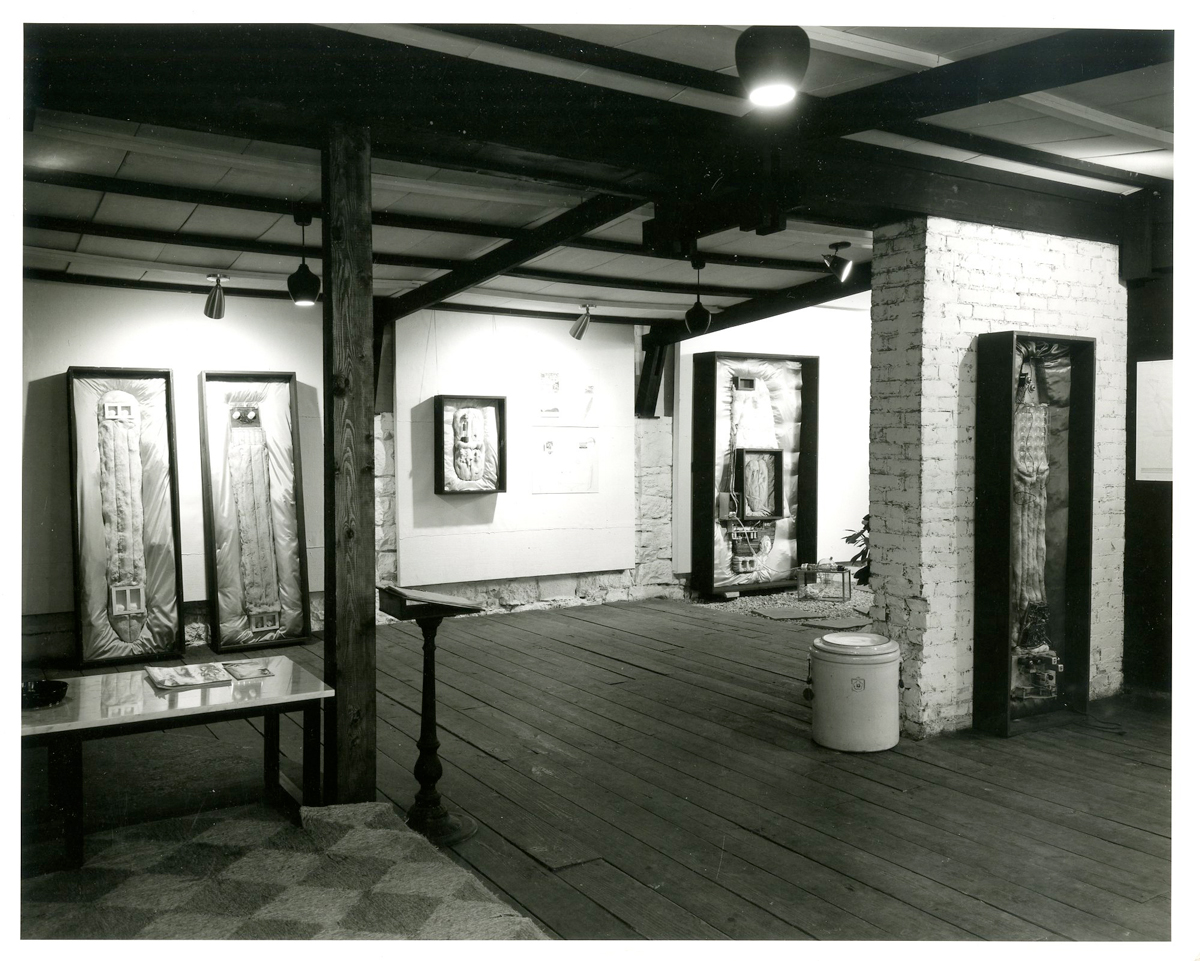
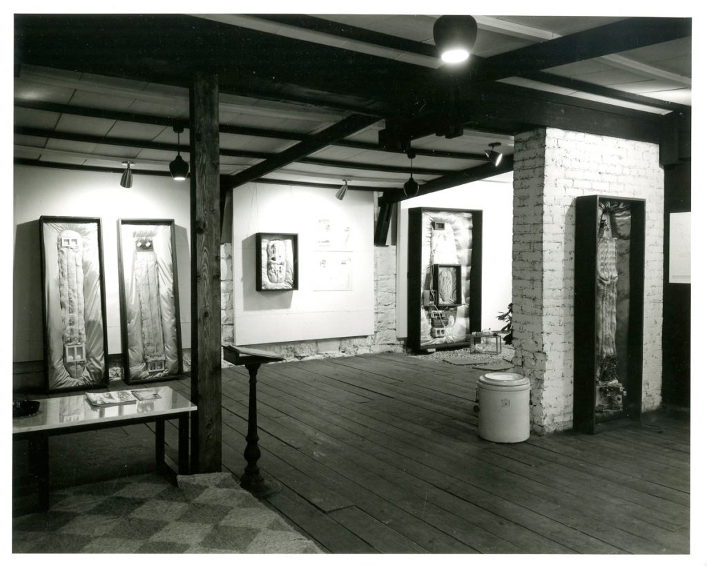
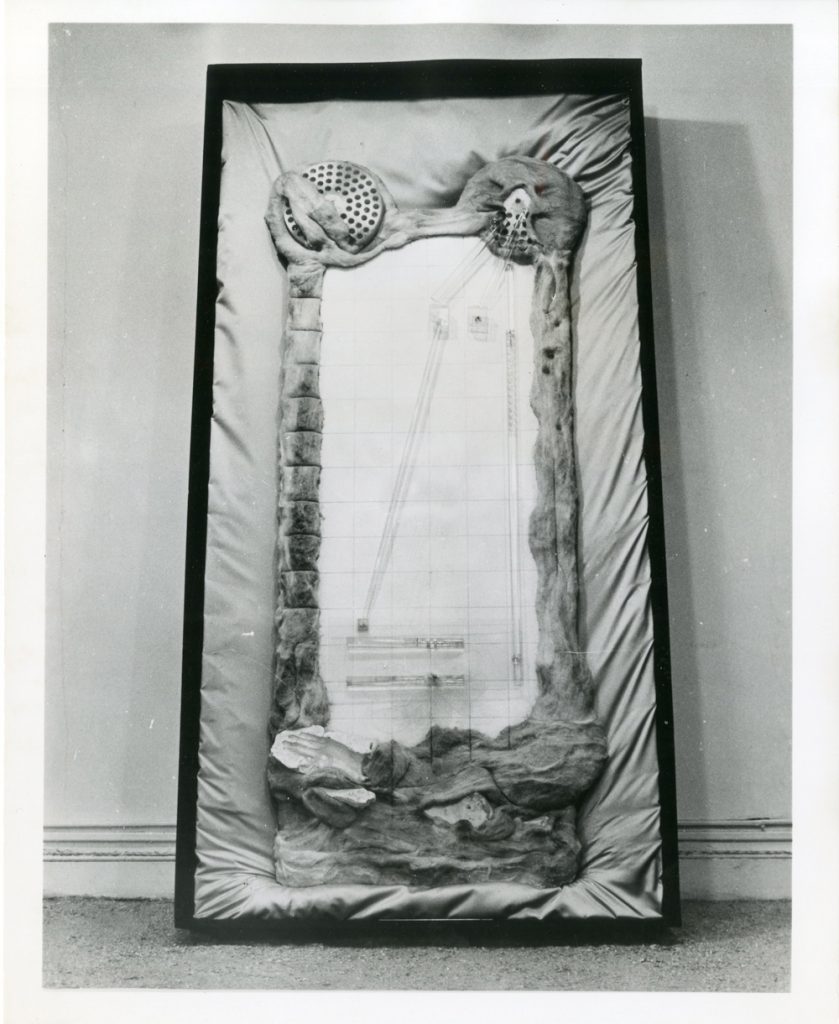
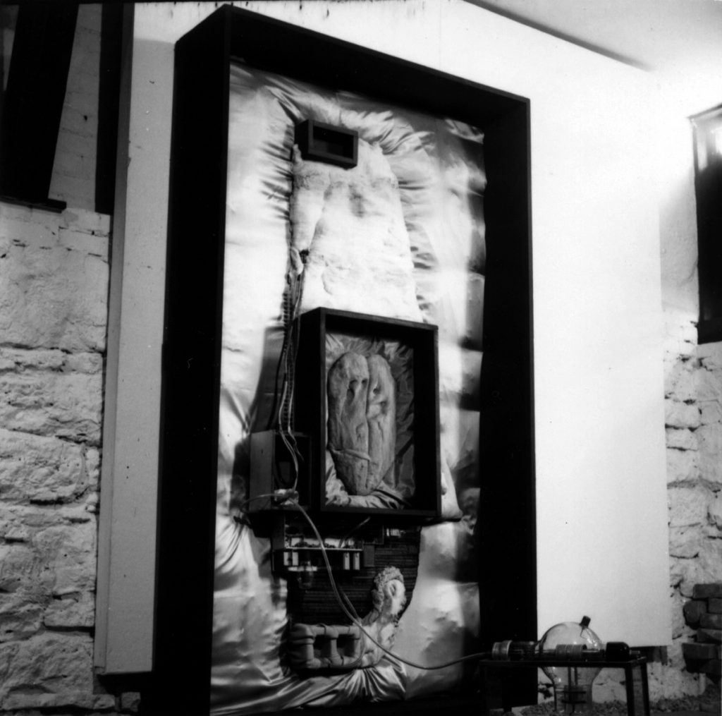
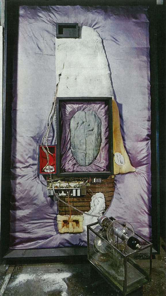
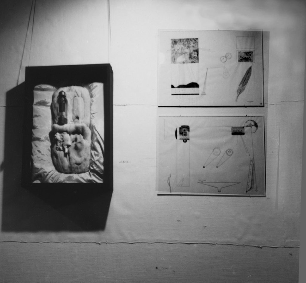
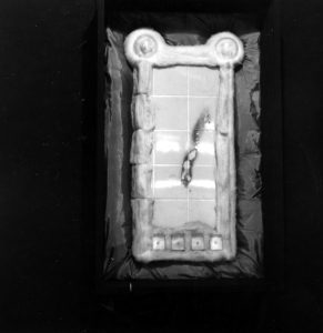
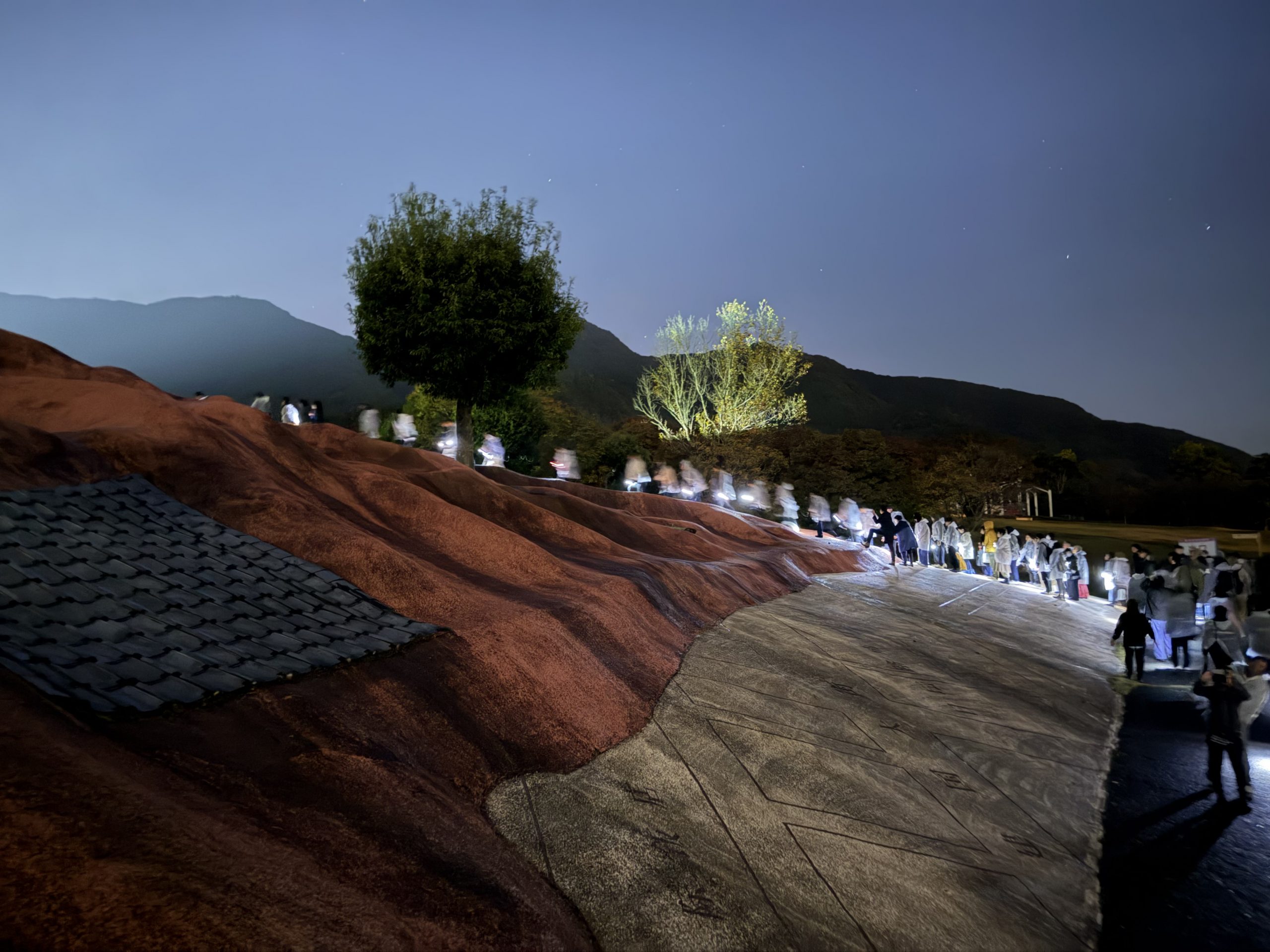
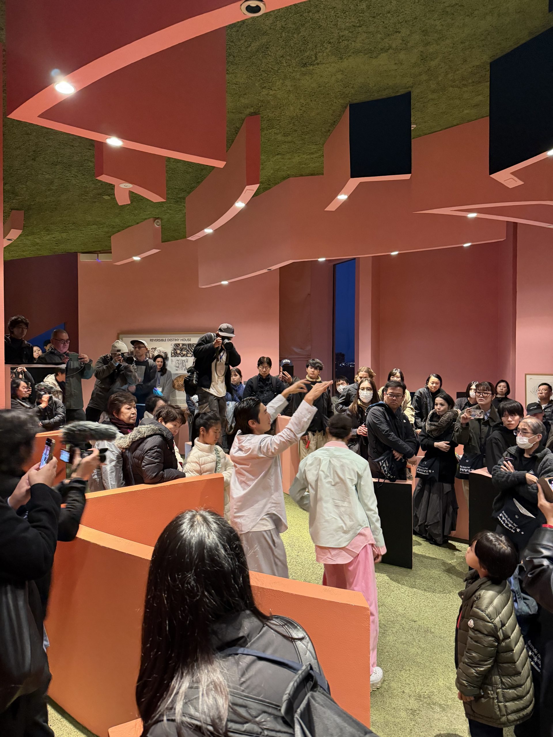
‘Beyond Body and Things’ by Neon Dance explores social connectivity and collaboration using bio-inspired robotics. The work is designed to unravel the origins of loneliness and explores the idea that loneliness stems from the interaction of the individual with the social realm, so that it is not just mental, but also physical, sensorial, and material.

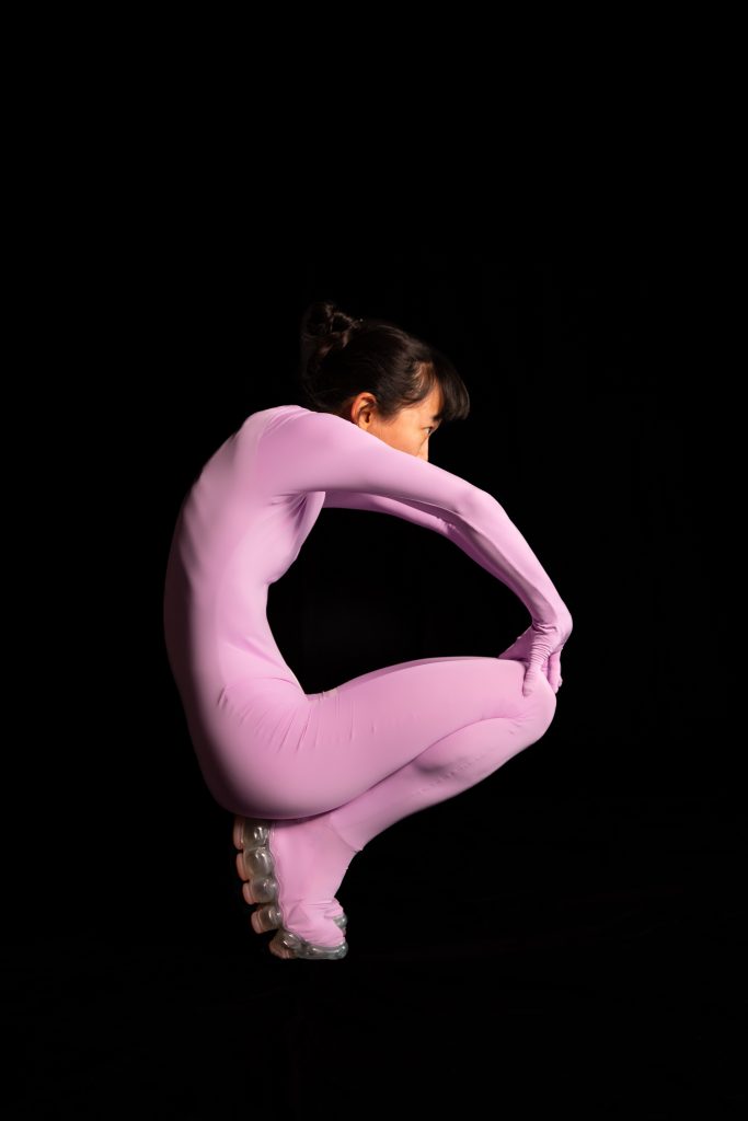
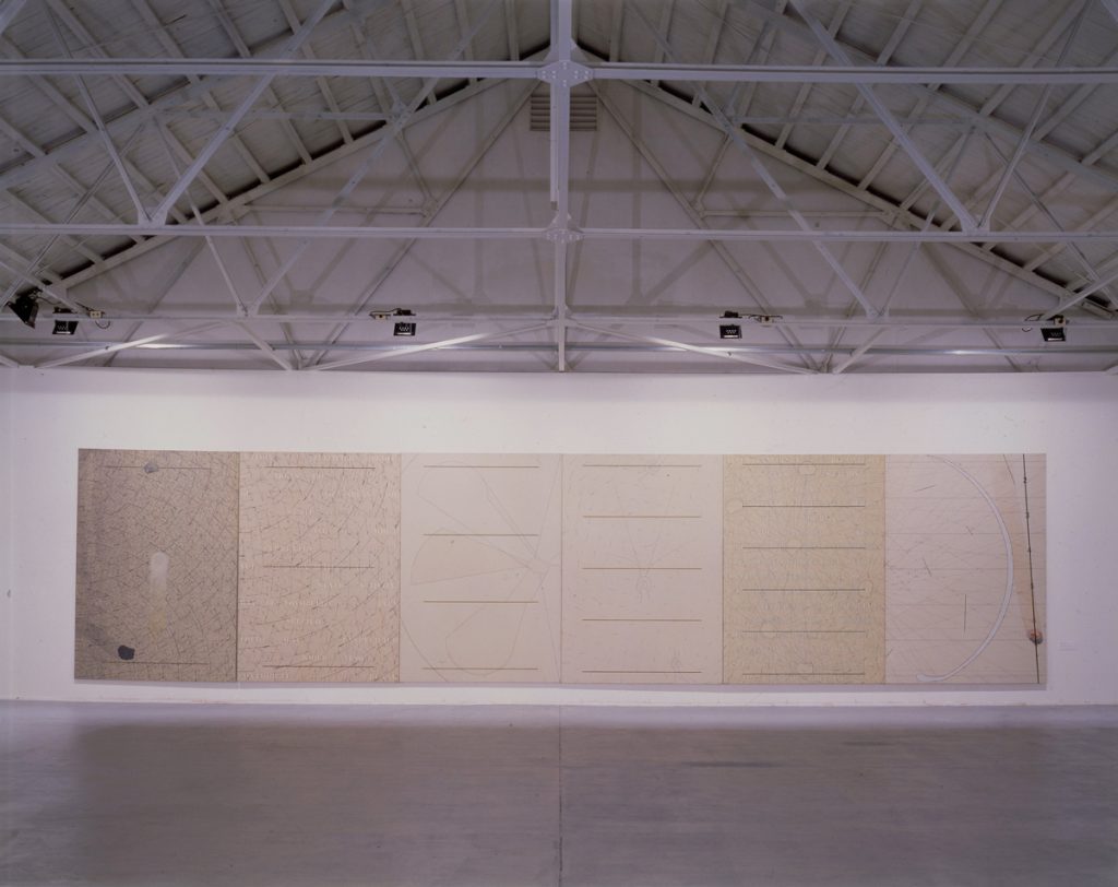
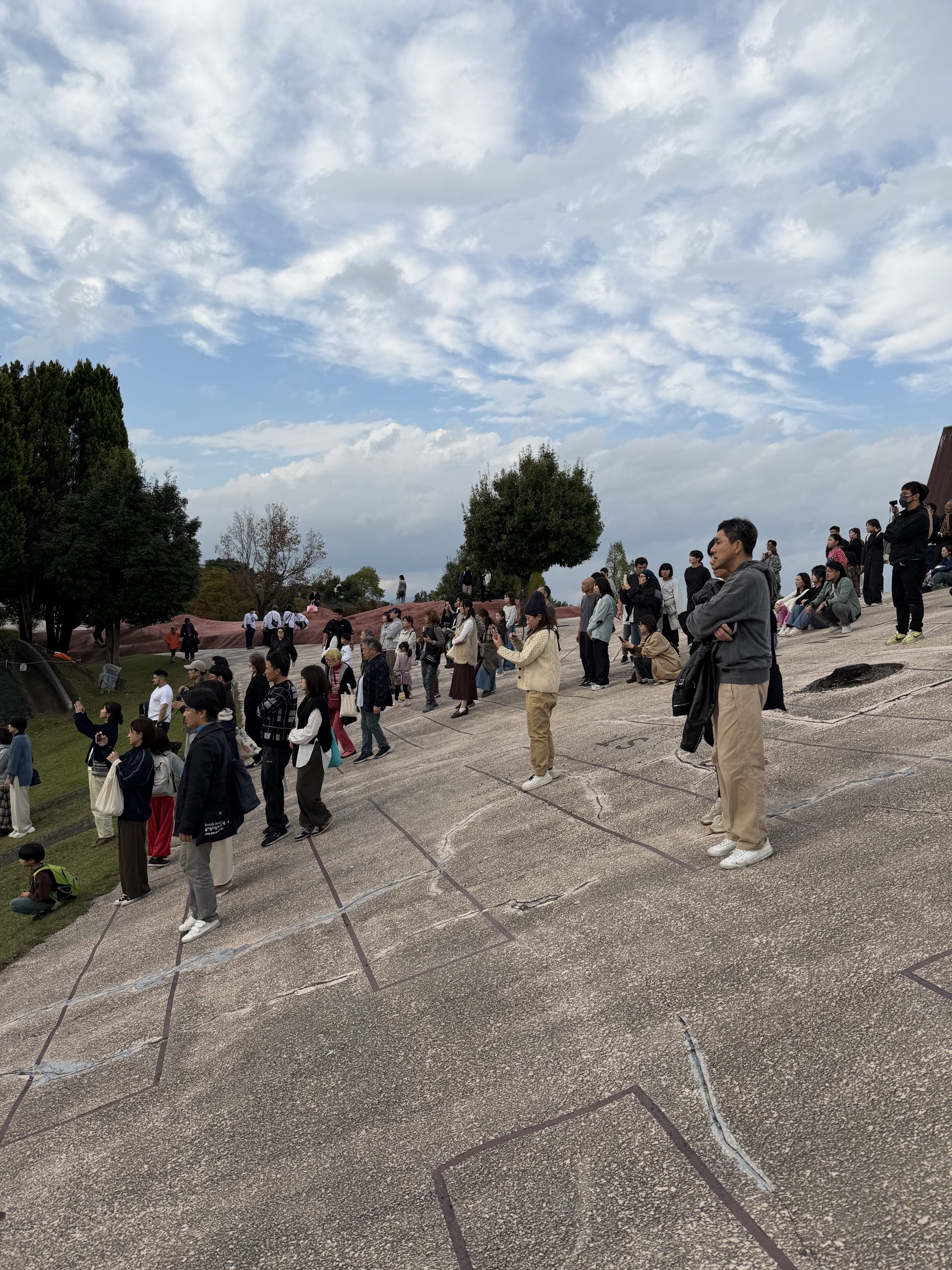
Adrienne Hart (Neon Dance) presented her work both at Echigo-Tsumari Art Triennale 2018 and Setouchi Art Triennale 2019. It was this experience of working with rural communities in Japan that led the artist to consider why, given our hyper connectivity, loneliness is so prevalent today.  ‘Beyond Body and Things’ invites participants to enter the installation and leave their mark in sand whilst interacting with robot creatures and a virtual performer. The work is an attempt to cultivate the ‘architectural body’—a concept formulated by Madeline Gins and Arakawa—as a potential cure to loneliness. Perhaps there’s little room for loneliness if life is a stream of constant connections where one relates not just to people but also objects and environment. 

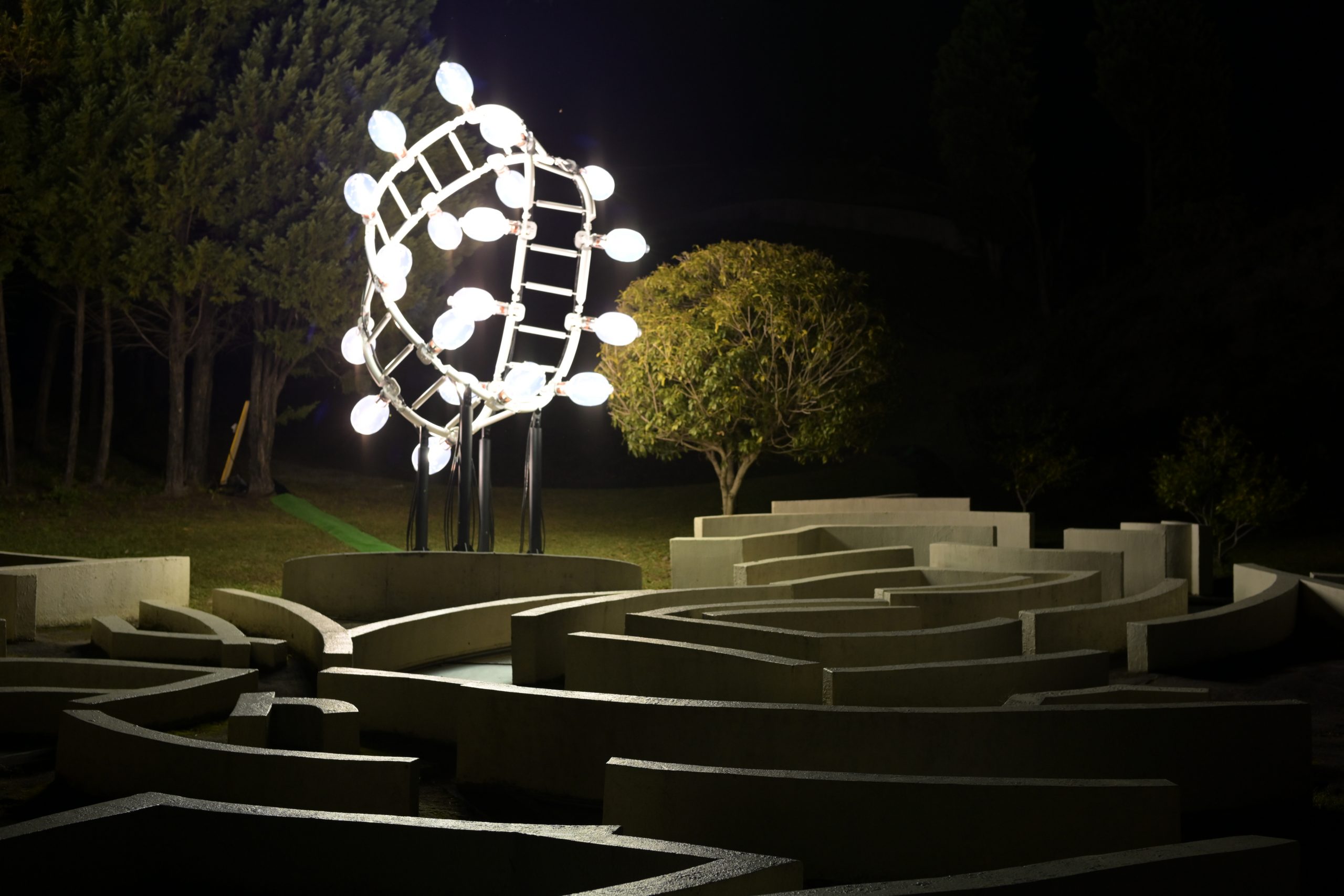
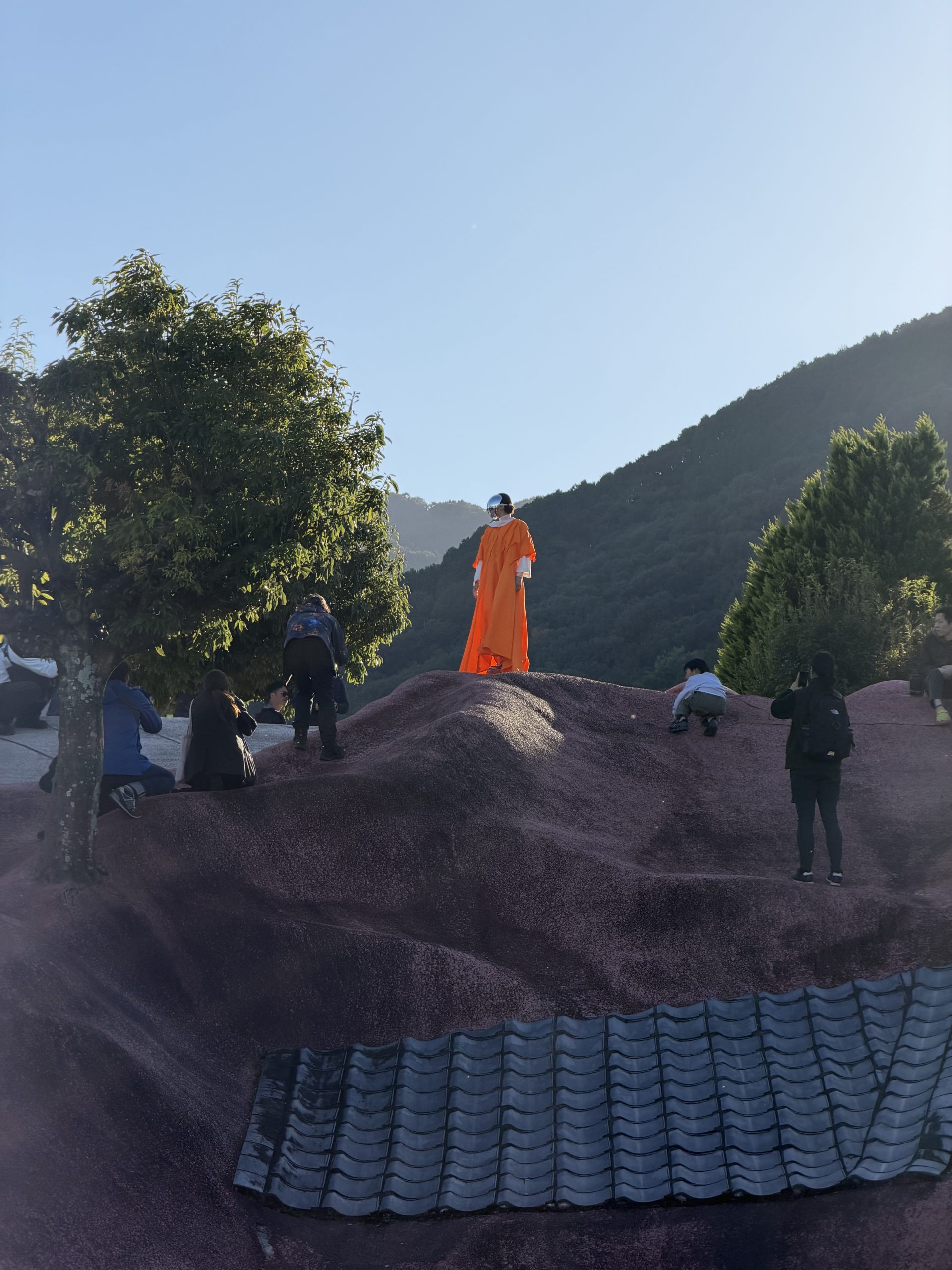
‘Beyond Body and Things’ is a collaborative work developed in 2021-22, during which time Neon Dance ran a series of ‘co-creation’ workshops with Bristol Robotics Lab, sharing and inviting members of the public to feed into the robot creation process. There are 2 twin robots that feature in ‘Beyond Body and Things’ with turtle inspired feet. The robots use tele-operation to enable a live performer from the UK to respond to audience members physically. Kneel down next to one and hold out your hand to become an attractor, the robots will follow and respond to your movement. At the end, step back and observe the sand painting created by both robot and human bodies. 

Event Information
https://setouchi-artfest.jp/en/event/detail495.html
November 3, 4, and 5 2022 
@Former YOSHIDA Sake Brewery, Tadotsu town, Kagawa, Japan
Setouchi Triennale 2022 https://setouchi-artfest.jp/en/


Credits

Concept / Direction:
Adrienne Hart

Choreography
Adrienne Hart in collaboration with Fukiko Takase

Robot Design and Concept 
Bristol Robotics Lab (Hemma Philamore, Alix Partridge and Calum Gillespie) 

Dance Artists
Fukiko Takase

Music
Sebastian Reynolds 

Costume
Mikio Sakabe 

Funded by 
Arts Council England National Lottery Project Grants, Brigstow Institute, The
Great Britain Sasakawa Foundation and EPSRC Impact Acceleration Fund.

Supported by 
Swindon Dance, University of Bristol, The Place, Wellcome Collection, Bristol
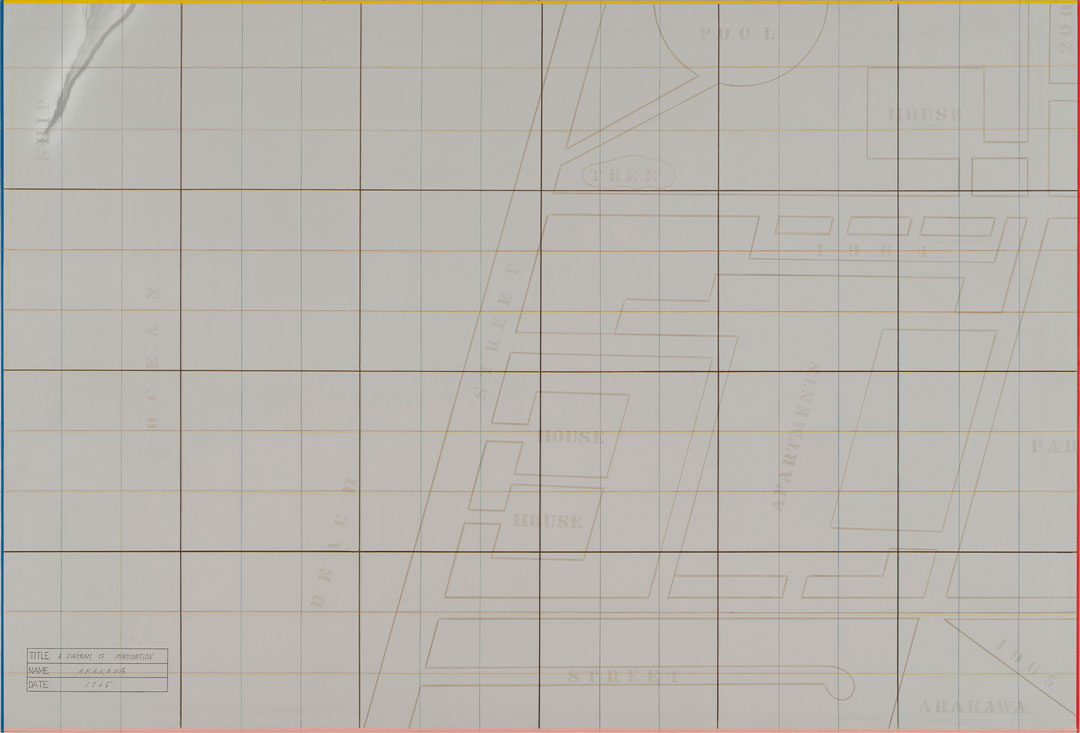
Beacon, Dance4, South East Dance, Reversible Destiny Foundation and Arakawa
+ Gins Tokyo Office

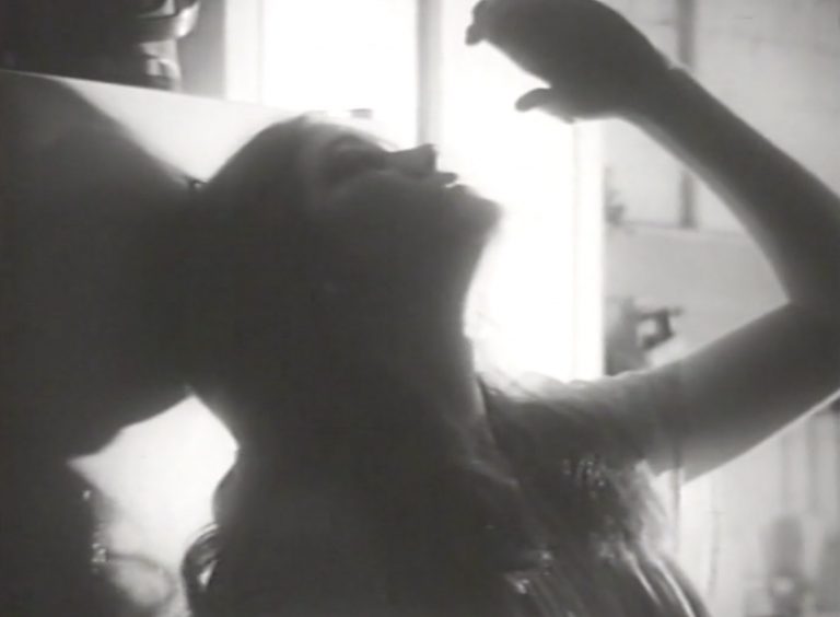
Top image: Photo by Miles Hart

Categories
front page Recent Exhibitions

STILL ALIVE – Aichi Triennale 2022

STILL ALIVE  Aichi Triennale 2022

Aichi Arts Center , Nagoya City, Japan

July 30 – October 10, 2022


We are pleased to announce that Arakawa and Madeline Gins will be participating in the Aichi Triennale 2022 “STILL ALIVE”.

For more information, visit https://aichitriennale.jp/en/

Categories
Newsletter

Ambiguous Zones, 10

Dear Friends,

Even though there are about two weeks left of summer in New York, where the RDF office is located, we have been inundated with advertisements for pumpkin spice everything (lattes, donuts, beer, etc.) since the last week of August. Rather than turn to this fall flavor already, we thought we would share the recipe for Banana Cake from Arakawa’s painting, Untitled, 1968, for Ambiguous Zones 10. Unlike your typical banana bread recipe, which is full of spice, this cake heroes the banana, and topped with pillowy layers of whipped cream, it sounded like a perfect dessert to celebrate the end of summer. While Arakawa most likely did not intend for the recipe to be baked, this painting offers a set of instructions that you can follow, as many of his other paintings explicitly ask you to do. It is always an interesting experiment to see the divergent outcomes when different people follow the same set of instructions.

joy-of-cooking

This recipe comes from the 1963 edition of The Joy of Cooking, which Madeline and Arakawa most likely had on their shelves and was often the first place you might look when searching for a recipe in the pre-internet era. With the proliferation of recipes available online today, the question is this: should you try this recipe at home? Only if you heed its first sentence: “Do try this, if you enjoy a banana flavor.” Without any spice to speak of, this cake indeed tastes like a mashed banana, so if that does not appeal to you, then you should find a different recipe. Two of RDF’s staff members who enjoy baking—Amara and Kathryn—came to this conclusion by baking it for themselves. Nonetheless, The Joy of Cooking remains an amazing resource and, perhaps tellingly, later editions dropped this recipe. When Kathryn asked her father if he still had his copy of this edition, he answered that he did not, but suggested several times that she instead bake one of Martha Stewart’s banana cake recipes (which do look very good). Amara’s mother still had her copy and kindly sent over a photograph, which is shared above. Despite Kathryn’s father’s warnings, Amara and Kathryn were determined to stick with the recipe that Arakawa painted. Kathryn did so to the letter and ended up with a very sweet and slightly dry cake. As a very experienced baker, she knew this was a likely outcome, but she altruistically followed through. The recipe really does call for an inordinate amount of sugar, given how sweet bananas are! Learning from Kathryn’s experience, Amara chose to interpret Arakawa’s label of “mistake,” written near the list of ingredients in the lower portion of the painting, as a license to make any mistake she wanted to and so she dramatically reduced the sugar and baked the cake for a shorter period. Both “mistakes” helped a lot! Kathryn chose to present her cake plain with slices from two bananas between the layers, one of the options in the recipe, but quickly served it with whipped cream as the recipe suggests. Amara sandwiched the layers with unsweetened whipped cream and an almost-two-year-old added banana slices from only one banana, leaving one slice vertical for reasons she did not state when questioned. Amara then topped the cake with whipped cream as well. In the end, their consensus is that banana bread, which usually calls for spices and less sugar, is better than banana cake, and that plums might be a better dessert fruit to bridge the gap between the end of August and the third week of September, seasonally still summer, but starting to feel a bit more like autumn. Sorry to this Banana Cake.

Yours in the reversible destiny mode,

Reversible Destiny Foundation and the ARAKAWA+GINS Tokyo Office

Top image: Arakawa, Untitled, 1968
Second image:
Irma S. Rombauer and Marion Rombauer Becker, “Banana Cake,” in The Joy of Cooking (Indianapolis: Bobbs-Merrill, 1963), 630.

Categories
front page News Recent Exhibitions

Dead Lecturer/distant relative:
Notes from the Woodshed, 1950-1980

Dead Lecturer/distant relative: Notes from the Woodshed, 1950-1980
 
Exhibition at the Miriam and Ira D. Wallach Art Gallery

Lenfest Center for the Arts, Columbia University
615 West 129th Street
New York, NY 10027

Through Oct 1, 2022
 
Arakawa’s paintings, Who is it? No. 2 (1970) and “No!” says THE SIGNIFIED NO. 2 (1973), are now on view as part of the group exhibition curated by Genji Amino, Dead Lecturer/distant relative: Notes from the Woodshed, 1950–1980, at the Miriam and Ira D. Wallach Art Gallery, Columbia University. The exhibition focuses on works by Asian American and African American artists whose approaches to abstraction provided alternatives to prevailing vocabularies for representation and resistance during the social movements of the 1960s and 70s, and for whom the parameters of visibility continue to remain a problem for thought today.

Image: Arakawa, “No!” says THE SIGNIFIED NO. 2, 1973. Acrylic, oil on canvas, styrofoam.
Collection Walker Art Center, Minneapolis; gift of Mr. and Mrs. Miles Q. Fiterman, 1991

Categories
Newsletter Programs

Ambiguous Zones, 9

Dear Friends,

For Ambiguous Zones 9, we travel to the Japan Pavilion at the 35th Venice Biennale that took place in 1970. Marking the first time the inner gallery was reserved for a single artist, art critic Yoshiaki Tono, the commissioner of the Japan Pavilion, chose Arakawa for that year.  Several canvases were exhibited from Arakawa’s large-scale project, The Mechanism of Meaning, which began in 1963 and was still in progress at the time.  Developed alongside Madeline Gins, this series of panels rigorously interrogated perception, the process of receiving, organizing, and interpreting information using our senses, in this case mainly sight. These works were accompanied by related drawings and diagrammatic paintings from the 1960s that turned the show into a retrospective of Arakawa’s work over the previous decade.

Yours in the reversible destiny mode,

Reversible Destiny Foundation and the ARAKAWA+GINS Tokyo Office

Floor plan sketch of the Japan Pavilion at the 35th Venice Biennale by Yoshiaki Tono, included in a letter from Tono to Arakawa delivered to New York on January 21st, 1970. From the archive of ARAKAWA+GINS Tokyo Office. This sketch was recently published in Benechia biennare to nihon (Japan at the Venice Biennale: 1952–2022), (Tokyo: Japan Foundation; Heinonsha, 2022), p. 222.

The 35th Venice Biennale took place in 1970 in the shadow of the student protests of 1968. To address what Yoshiaki Tono, the commissioner for the Japan Pavilion in 1970, saw as problematic with the exhibition’s national framework, he decided to choose an artist, Arakawa, who reflected what he felt could be a common theme for the Biennale as a whole—the practice of conceptual art.[1] This was the first time that the inner gallery of the Japan Pavilion had been dedicated to a singular artist, though a sculpture by Mono-ha artist Nobuo Sekine was included outside.

The focus of the show was several large panels from The Mechanism of Meaning, a project that was still in progress, began in 1963 with Arakawa’s partner, Madeline Gins. This was the first time that The Mechanism of Meaning was shown, with Arakawa and Gins completing the project for its first publication in 1971.

Installation view of the Japan Pavilion at the 35th Venice Biennale, 1970. Photo: Yoshiaki Tono

Drawings and canvases from the 1960s rounded out the gallery, creating a retrospective of Arakawa’s work from that decade. Like The Mechanism of Meaning, these works explored the process of meaning-making through language, and the different stages of (mainly visual) perception—stimulation, observation, interpretation—occurring at both the preconscious and conscious levels.

The Biennale catalogue entry was written by Greek-American poet and art critic Nicolas Calas, who used the allotted space to explore in brief Arakawa’s use of signs in a strange context to make the viewer question what their next “visual move” should be.[2] Calas suggested that offering simple instructions when the “visual structure of the reference is unexpected” served to widen the rift “between what you see and what you know.”[3]

In an article for the New York Times, Frederic Tuten discussed the boycott of the American Pavilion by “more than half of the 47 American artists”, who withdrew their works “in protest against the war in Vietnam and Cambodia.”[4] Naming Richard Smith and Arakawa as the only two artists pursuing more traditional art “worth discussing,” he goes on to offer these considerations of Arakawa’s work:

Arakawa’s series of 13 paintings bear images and text—words and sentences posed as instructions to the viewer—which if taken literally would blur or modify the viewer’s reading of the images and which also serve as visual structures in the painting. The work seems superficially formal and frigid but it decidedly carries great reserves of intelligence and personality.[5]

As at the 34th Biennale in 1968, where artists protested war, unfair working conditions, and uneven power structures in part by removing their works from display by turning them to face the wall or covering them up, American artists also made a political statement at the 35th Biennale by pulling their work altogether. The power of the artist is distilled into this simple act of withholding work so that it cannot be seen, making both its display and lack of display a political act as well as a social one. Arakawa’s work may not seem overly political at first glance, but in the context of the 35th Venice Biennale, following the upheaval of the 34th, it becomes evident that Arakawa and Gins’s exploration of visual perception, as well as the very act itself, straddles both the political and social realms. 

We hope you enjoy these photographs of Arakawa’s work at the Japan Pavilion at the 35th Venice Biennale!

[1] Ignacio Adriasola, “Japan’s Venice: The Japanese Pavilion at the Venice Biennale and the ‘Pseudo-Objectivity’ of the International,” Archives of Asian Art 67, no. 2 (2017): 223.

[2] Nicolas Calas, “Shusaku Arakawa,” in 35. Biennale internazionale d’arte: 24 giugno-25 ottobre 1970 (Venezia: La Biennale di Venezia, 1970), 46.

[3] Ibid., 47.

[4] Frederic Tuten, “Soggy Day in Venice Town,” New York Times, July 12, 1970, sec. Archives. https://www.nytimes.com/1970/07/12/archives/soggy-day-in-venice-town-soggy-day-in-venice.html.

[5] Ibid.

Top image: Arakawa at a café in Piazza San Marco, Venice, most likely 1970, on Polaroid paper stock dated to 1969. The café in question is most likely Caffè Lavena.

Categories
Newsletter Programs

Ambiguous Zones, 8

Arakawa, Non-Gravitational Being, 1983-1984, acrylic, graphite, art marker and PVA on canvas (in two parts), 100 x 136 in. Photo: Rob McKeever

Dear Friends,

Ambiguous Zones 8 takes a close look at Non-gravitational Being, 1983-84, a large-scale painting by Arakawa. This artwork offers a short text on Arakawa and Gins’s concept of “Blank” and stands as a good introduction to the work being done by Arakawa in the early 1980s. A short formal analysis of the painting will leave you primed to meditate on the artist’s ideas about spacetime, energy-matter, and how gravity might work in different dimensions. Hopefully you will enjoy this brief contemplation on physics all the more knowing that scientists were wrong, luckily, in their prediction that asteroid 2009 JF1 would hit the Earth on May 6th, 2022!

Yours in the reversible destiny mode,

Reversible Destiny Foundation and ARAKAWA+GINS Tokyo Office


Non-gravitational Being, 1983-84: A Meditation

by Amara Magloughlin

Arakawa’s painting, Non-gravitational Being, 1983-84, sets up the viewer to encounter a large-scale map covered with arrows pointing in different directions in a pattern reminiscent of air currents. The far-left side of the map appears to be incomplete, but is it unfinished? Has it been erased in some way? Perhaps the mapmaker was not able to fill the rest of the canvas out of ignorance of what should be there, or perhaps the area has yet to be charted. There are endless possibilities including the fact that they may have interrupted an event in mid-flow or that the painting is waiting to be activated by the viewer to finish its development, just as the viewer will in turn develop alongside or with the painting. At 100 x 136 inches, the size of the canvas overwhelms the viewer, perhaps making them feel dislocated rather than better able to find their way as a map ought to do. This immersive inarticulation serves to prolong the moment of proto-perception that interested Arakawa so much. In his own words, he wanted to paint “the condition that precedes the moment in which the imagination goes to work and produces mental representations.”¹ It is possible that this is represented on the canvas, but in this instance, Arakawa has worked to lengthen this effect in the viewer—both artwork and viewer need the other for activation.

The various elements in the painting appear to occupy parallel planes, of which I count at least five. The map is the furthest back on the fifth plane, which includes the yellowed varnished area. The fourth plane has text stenciled across it in a seemingly sporadic manner with equally sporadic splotches and drips of paint. This plane also contains a white circle faintly visible beneath the black line of the three-pronged symbol (which will be mentioned below) on the left panel, as well as text stenciled upside-down at the top of the canvas. The third plane is occupied by arrows circulating over these phrases. The second plane holds the black, yellow, and red lines that form a sort of axis and the dark grey sphere. To my eye, the curved line circumscribing the bottom of the canvas, the two bolder directional arrows that perhaps indicate movement in opposite directions along this line, and the rectilinear shapes that move off the top of the canvas seem to exist on the first plane closest to the viewer.

Arakawa, A Diagram of Imagination, 1965, acrylic, graphite, colored pencil, pastel, art markeron canvas, 61 x 91 in. Photo: Rob McKeever

It would be difficult to develop an interpretation for this painting without examining other works by Arakawa with similar motifs and more snippets of text, both of which serve to elucidate Arakawa’s philosophical thought. Arakawa’s earlier diagram paintings include examples of maps with labels indicating certain elements, like STREET or OCEAN, as seen in A Diagram of Imagination, 1965. In the early 1980s, instead of these labels we find maps with elevations of tourist attractions locating objects in space. This is simply a different kind of sign, and one that is instantly recognizable as belonging to a tourist map. The iconic shapes of these buildings are as recognizable as their written names to the local population. For an international audience, such elevations might be more useful in deciding whether they have reached the right spot. In any event, this two-dimensional representation of space includes a nod to the three-dimensional world with the spare elevations of monuments that speak to the national identity of the inhabitants of this city. Indeed, they are so recognizable that with close inspection the viewer may begin to be able to identify what they are looking at. The Cathédrale de Notre-Dame de Paris is particularly iconic in shape and given its position near the dark grey sphere, it might be one of the first buildings that the viewer notices. Moving along the Seine to the left, the Louvre and the Jardin des Tuileries become apparent. Below this, the Palais du Luxembourg and the Panthéon among others are also identifiable. Even though we now feel we are in Paris, the city itself is interchangeable for the meaning of the painting. Since we have not yet found the map that Arakawa used to make this painting, it is not clear if he changed the streets in any way. Tourist maps are notorious for simplifying the street map, narrowing their usefulness to locating highlighted landmarks and sometimes not even those.

The sentences stenciled across the top of the two panels read as follows: “ALONG THE WAY, WITHIN ENERGY-MATTER, SOME INDIVIDUALS / FORM BLANKS. AS BLANKS FORM, SPACETIME WILL APPEAR. BLANK / IS THE MEDIUM OUT OF WHICH SPACETIME COMES”. While this text appears upside-down at the top of the canvas, some of the same words float randomly across its surface. Are we meant to see these as “non-gravitational beings”? They do not appear to correspond to anything on the map, but they do seem to align themselves around the contours of the varnished, yellowed section of the right panel. Is this indicating a different texture or density within spacetime that the words are reacting to or affected by even while they are not affected by gravity? They float outside of the structure of the sentence, which is nonetheless provided to the viewer, though in a way that may cause some disorientation. Which way is up becomes hard to say categorically, especially when dealing in beings not governed by gravity. Sentences like these that expound upon “Forming Blank” are found in many other paintings from around this time. Taken together, they lend extra insight into the ways in which this work may be read. The same can be said for the next plane, with arrows being one of the most commonly recurring motifs in Arakawa’s work. The arrows also have to do with Blank and its forming. This will be explored more deeply in a forthcoming article. For now, one interpretation might be that energy-matter, perhaps starting from the dense sphere, generates the forming of blanks out of which unfolds spacetime, as indicated by the arrows.

Arakawa, Proper Noun, 1983-1984, acrylic, graphite, art marker and varnish on canvas (in two parts), 100 x 136 in.

This dense, dark grey sphere on the right panel is worth looking at more closely. It is similar to the imperfect flat black circle on the left-hand panel in Arakawa’s painting, Proper Noun, 1983-84. In that instance, if we are to accept Gins’s interpretation of this painting in Helen Keller or Arakawa, 1994, that the map, representing spacetime, unfolded from this circle, Arakawa has presented a sequence for the event represented: on the left-hand side of the panel the unfolding has not yet taken place, so the dot holds every potential happening. By the time of the right-hand panel, the dense energy-matter has unfolded and has been cleaved, resulting in openings and variation in tissues of density, which can perhaps be seen in the hazy white patches on the right panel. It is a flat, two-dimensional circle, but if the energy-matter inside is condensed, then perhaps its dimensional existence can be condensed as well, as in the case, potentially, of a black hole. If we understand the same unfolding of energy-matter to be taking place in Non-gravitational Being, then we must also forgo any sense of a sequence of events, since both the sphere and the unfolded spacetime are represented, though possibly on different dimensions. If the unfolding only truly begins to take place with the viewer present to activate it, then in some senses this sphere does act as a “YOU ARE HERE” dot—though it is not necessarily locating the viewer literally on the Île de la Cité. This does not negate the possibility that the viewer IS there, especially given that Arakawa appears to be dealing in different dimensions.

Arakawa, That In Which No.2, 1974-1975, acrylic, graphite, art marker and collageon canvas, 65 x 102 in. Photo: Rob McKeever

Moving to the left panel, it is harder to find a precedent for the three intersecting lines in other paintings showing maps. Perhaps this black, yellow, and red symbol is meant to indicate the Cartesian coordinate system, with three axes meeting at the point of origin, here representing three-dimensional space (width, length, and height). This is not to limit the dimensions in Arakawa’s painting to three. It seems likely that Arakawa is including density and texture as other calculable dimensions, an idea borne out by other paintings, and, if so, the three intersecting lines may represent something slightly different. Nevertheless, let’s accept for a moment that in Non-gravitational Being the Cartesian axes denote three-dimensional space. If this is the case, then the arrows could be read as time, representing the fourth dimension. In this scenario, time is not behaving in the way we are used to perceiving it, since it is moving in many directions. We are in a world created by the canvas and the rules are Arakawa’s, so while time can behave in anyway the artist sees fit, it seems more plausible that in Arakawa’s configuration of elements the arrows indicate the unfolding of spacetime, as previously theorized. Moving to the sphere, it can be seen as being comprehensive of more than three dimensions whether condensed or not. Regardless, the first and closest plane in relation to the viewer, with its curve at the bottom of the canvas may represent four dimensions as curved space.

When all elements are taken in together, the viewer most likely does not feel like they have been transported to Paris, so this is not an effective stand-in for a landscape painting. Instead, the viewer might begin to understand how spacetime and Blank relate during this unique act of perception. The viewer might not yet be at the stage in which they perceive themselves as Blank, but there are many other paintings and encounters staged by Arakawa that will get them there. For now, it is enough to understand that energy-matter can have different densities and textures and that this will affect the ways in which perceiving beings experience spacetime as it unfolds. These ideas will be explored further in a forthcoming article.

¹Charles Haxthausen, “Diagrams for the Imagination,” in Arakawa: Diagrams for the Imagination, ed. Ealan Wingate (New York: Gagosian, 2019), 13. In the corresponding endnote, Haxthausen states that this is his own “translation from the Dutch of what was clearly a Dutch translation from the Japanese” found in: Yoshiaki Tono, “Het schilderen van Shusaku Arakawa: een voorstadium van de verbeelding,” Arakawa, exh. cat. (Eindhoven: Stedelijk van Abbemuseum, 1966), n.p.

Categories
AG conferences Events front page News

“AGxKANSAI 2022” Arakawa and Gins International Conference

We are happy to announce the international conference AGxKANSAI 2022: Art and Philosophy in the 22nd Century After ARAKAWA+GINS, organized jointly by the Studies of the Architectural Body Research Group at Kansai University and Kyoto University of the Arts. The event will take place on March 11–15, 2022 at Kyoto University of the Arts with a combination of in-person and virtual presentations and a live broadcast of all sessions available online. Registration is now open through the conference website!

AGxKANSAI 2022: Art and Philosophy in the 22nd Century After ARAKAWA+GINS
Date: March 11–15, 2022
Venue: Kyoto University of the Arts, Kyoto, Japan (on-site and online)
Website: https://www2.kansai-u.ac.jp/agx2022/

Building on the issues and themes explored at previous Arakawa and Gins conferences (AG1: University of Paris X, 2005; AG2: University of Pennsylvania/Slought Foundation, 2008: and AG3 Online/Columbia University/Solomon R. Guggenheim Museum, 2010), AGxKANSAI 2022 will explore the shape of art and philosophy toward/in the 22nd century through lectures, dialogues, presentations, exhibitions, and performances. “After ARAKAWA+GINS” signifies our desire to follow after their future-forward vision even after their untimely demise.

The conference opens on March 11th with a conversation between Takashi Ikegami and Yasuo Kobayashi, followed in the afternoon by a virtual tour of the exhibition, the first on-site paper session, a conversation between Hideo Kawamoto and Naohiko Mimura, and an online lecture by Adrienne Hart. From March 12th, various programs will take place including round-tables, research presentations, and workshops by Arakawa and Gins researchers from Japan and abroad. A reproduced version of Arakawa’s early installation work Bottomless I (SOCIOUS),1963, will be on view in conjunction with the event.

Please do not forget to register in advance

Bottom image: Arakawa, Bottomless I (SOCIOUS), 1963,
acrylic panel, cloth, mirror, steel, steel mesh, steel wire, string, and thread, 41 x 100 x 100 in.

Categories
Newsletter

Ambiguous Zones, 7

Dear Friends,

Ambiguous Zones 7 features a video recording of our January 12th, 2022, webinar with guest speaker Tiffany Lambert, curator of the Gallery at Japan Society in New York.  Tiffany’s lecture focused on the connection between Arakawa’s art and Arakawa+Gins’s architecture. We hope you find it as illuminating as we did!

Moving forward, Ambiguous Zones will arrive at your inbox every two months, which will give us time to explore certain topics in greater depth. In the meantime, please join us for the international conference AGxKANSAI 2022: Art and Philosophy in the 22nd Century After ARAKAWA+GINS, organized jointly by the Studies of the Architectural Body Research Group at Kansai University and Kyoto University of the Arts. The event will take place from March 11–15, 2022 at Kyoto University of the Arts with a combination of in-person and virtual presentations and a live broadcast of all sessions available online. We look forward to seeing you there, whether virtually or in person!

Yours in the reversible destiny mode,


Reversible Destiny Foundation and ARAKAWA+GINS Tokyo Office

Lecture by Tiffany Lambert on the art and architecture of Arakawa+Gins, January 12, 2022

Top image: Installation view of ARAKAWA: Waiting Voices at Gagosian Gallery, Basel, November 25th, 2021–January 22nd, 2022. Photo: Annik Wetter
(Left) Hard or Soft No. 3, 1969, acrylic, graphite, and marker on canvas, 95 ½ x 65 in.
(Right) A Couple, 1966–1967, oil, acrylic, marker, graphite, and crayon on canvas (in two parts), 95 x 124 in.

Categories
Events front page News Recent Exhibitions

ARAKAWA: Waiting Voices at Gagosian Gallery in Basel

The exhibition ARAKAWA: Waiting Voices at Gagosian Gallery in Basel will be opening on November 25th, 2021. It will be on view through January 22, 2022.

The exhibition features Arakawa’s paintings and drawings produced between 1964 and 1984, the twenty-year span that saw him experimenting with diagrammatic motifs, language, texture, and space that ultimately led the artist, together with Madeline Gins, to the field of architecture. For further information, please visit the Gagosian website.

In conjunction with the exhibition, the Reversible Destiny Foundation will host a virtual lecture by Dr. Ignacio Adriasola, live from Basel on December 9th, 11 AM EST. Focusing on works featured in the exhibition, his talk will address major developments in Arakawa’s practice through the mid-1980s. This program is approximately 1 hour in length, including Q&A at the end. Click here to register in advance! 

Lecture Précis:

The white on off-white ground of an immense canvas stretches before us, like sand on a beach. Overlapping layers of acrylic varnish divide its surface creating a subtly dark imprint. Thin graphite lines stretch and direct our gaze across the canvas, indicating the shortest distance possible between enigmatic figures and words. Objects leave their mark, like shadows. As we step away from the canvas, we begin to discern a secret geometry: waiting voices, captured right at the moment before thought finds form.

Arakawa’s canvases speak a language that is at once simple, yet hard to understand. It is impossible to access them without poetry: one finds drawn images and words that never meet; instructions that can’t be fulfilled; invitations that remain unopened. Someone’s voice emerges within, everywhere and nowhere at once. The voice traps us in descriptions pointing to non-existing things: “This rectangle is a photograph of this entire painting,” one work claims, but, of course, there is no photograph in the canvas. Another entices us to imagine implausible qualities and actions, such as “sizeless,” “hypostatize,” “to cleave.” The works describe, direct, admonish, and tease the viewer. And like all good teases they are at once sensual and metaphysical, comical and dead-serious.

If painting is traditionally imagined to belong and reflect the constituted world, Arakawa inverts that relationship. This is because, as Duchamp once noted of Arakawa’s diagrams—and Madeline Gins constantly reminded us since—these are not paintings. Where did these post-paintings come from? How do they operate? Focusing on works featured in this exhibition, my talk will address major developments in Arakawa’s practice through the mid-1980s. I will situate Arakawa in relation to the reception and theorization of surrealist practices in Japan, and I will trace the shift his work took since his emigration to New York, and the beginning of his life-long collaboration with his partner, the critic and poet Madeline Gins.

In brief: the post-paintings emerge as a means first of examining the world of objects in their state as a yet-unformed possibility. Madeline Gins noted that the diagrams model, but are not just models. Arakawa found in them a method for examining potentiality, by indexing with a secret geometry a place somewhere beyond existence. Arakawa’s work sparked important critical debates on the nature of the image (Nakahara Yūsuke and Nicolas Calas), of absence and presence (Miyakawa Atsushi and Jean-François Lyotard), and on art’s capability as a “thinking field” (Gins), opening up a line of investigation that eventually led him to the body as the place where possibility resides.

Lecturer:

Dr. Ignacio Adriasola teaches in the Department of Art History, Visual Art and Theory at the University of British Columbia. His research focuses on experimental art and culture in postwar Japan. His book Fragment, Image, and Absence in 1960s Japan is forthcoming from PSU Press (Fall 2022).

Top Image: Arakawa, Waiting Voices, 1976–77,
acrylic, graphite, marker, and varnish on canvas and linen (in 2 parts), 70 x 96 in. Photo by Robert McKeever

Bottom Image: Dr. Ignacio Adriasola at the Reversible Destiny Lofts—Mitaka (In Memory of Helen Keller), Tokyo, 2017.
Photo by Takeyoshi Matsuda

Categories
Newsletter

Ambiguous Zones, 6

Dear Friends,

Happy New Year of the Tiger!

We hope you had a restorative holiday break. At the dawn of 2022, all of us here at the Reversible Destiny Foundation and the ARAKAWA+GINS Tokyo Office are looking resolutely toward the new horizon, fresh with limitless possibilities, following Arakawa and Madeline Gins’s commitment to a positive mindset coupled with (serious) playfulness.

We begin the year with the sixth issue of Ambiguous Zones, which features a video recording of a lecture by Dr. Ignacio Adriasola that took place on December 9th of last year, live from the exhibition ARAKAWA: Waiting Voices at Gagosian Gallery in Basel (on view until January 22nd). In his lecture, Dr. Adriasola illuminates some of the recurring themes and motifs present in the works of Arakawa on display at the gallery, which range in date from 1964 to 1984, and brings to the fore the sensuality of texture and materiality in the artist’s paintings.

Our next webinar will be on January 12th at 12pm EST with guest speaker Tiffany Lambert, Curator of the Gallery at Japan Society in New York. Her lecture will focus on the connection between Arakawa’s art and Arakawa+Gins’s architecture. We hope you will join us to continue learning more about their work! (click here to register in advance).

Yours in the reversible destiny mode,
Reversible Destiny Foundation and ARAKAWA+GINS Tokyo Office

Lecture and virtual tour by Dr. Ignacio Adriasola of the exhibition ARAKAWA: Waiting Voices at Gagosian Gallery in Basel, December 9th, 2021

Top Image: Arakawa and Madeline Gins, Study for Sites of Reversible Destiny, digital rendering, ca. 1994

Categories
Newsletter

Ambiguous Zones, 5

Dear Friends,

This fifth issue of Ambiguous Zones arrives partway into the holiday season. Like last year, the final few weeks of 2021 may not feel quite the same as previous years, but that is all the more reason to focus on spending time with loved ones, whether in person or online. The RDF archive has no shortage of photographic evidence that Madeline and Arakawa did just that year round. Regardless of how your celebrations shape up this year, we hope these photographs of Madeline and Arakawa dining with friends and family get you into the festive spirit!

We also hope you will join us virtually for Dr. Ignacio Adriasola’s lecture and tour of the exhibition ARAKAWA: Waiting Voices, live from Gagosian Gallery in Basel on December 9th at 11am EST (click here to register in advance). 

In the meantime, we are sending warm wishes for a lovely December!

Yours in the reversible destiny mode,
Reversible Destiny Foundation and ARAKAWA+GINS Tokyo Office

Arakawa and Madeline drink coffee and eat pie inside after their meal outside, ca. 1977.
Madeline calls across the table to a guest at a dinner party at 124 W Houston St.
Arakawa laughs at a dinner with friends at 124 W Houston St.
Arakawa and Madeline eat with a friend at a reception.
Hotpot dinner with friends. Madeline with James Rossant (1928–2009; architect, artist) and another friend, ca. 1978.
Arakawa and Madeline gathered around the table with friends, 1977.
Arakawa and Madeline, post-dinner chat, with fruit and vegetables in a bowl, at 124 W Houston St.
Arakawa, mid-bite
Arakawa, Madeline, friends, and a delicious meal
Madeline and Arakawa relax over what appears to be breakfast.
Arakawa and Madeline at the cabin in Croton-on-Hudson, Westchester County, NY, enjoying what looks like an enticing Autumnal drink
Arakawa or Madeline enjoying a meal at a counter seat of a Japanese restaurant
Arakawa and Madeline with a group of friends, including Yoshiaki Tōno (1930–2005; art critic; on the right at the back), at a restaurant in New York, August 1978
Arakawa celebrates with friends and champagne.
Madeline and Arakawa share dinner at 124 W Houston St. with Colette Rossant (b. 1932; food critic; on the left, foreground), her husband James Rossant (on the left at the back), and their children (on the right).

Top image: Thanksgiving in July, or a heatwave or somewhere warm in November? Madeline Gins, Arakawa, and Madeline’s parents, Evelyn Gins, and Milton Gins enjoy turkey (or duck?)
in the great outdoors, ca. 1977.

Categories
Newsletter

Ambiguous Zones, 4

Dear Friends,

In honor of Madeline Gins’s birthday on November 7th, the fourth edition of Ambiguous Zones focuses on one of her unpublished books. Madeline considered two possible titles that sum up the content quite well: “Conversations for our time: poet and physician” or “Medically in Our Time.” This book is based on a series of interviews that Madeline carried out with doctors with a variety of specialties, including neurology and psychiatry, an acupuncturist, and patients. Her overarching goal was to provide a course of action for the patient/reader that would help them navigate different approaches to their healthcare, including standard medical care, alternative therapies, vitamin regimens, and care related to their mental health, whether through psychiatry or other mind-body modalities like meditation and hypnosis.

Help us celebrate Madeline’s 80th birthday by doing whatever mind-body exercise speaks to you the most.

Yours in the reversible destiny mode,
Reversible Destiny Foundation and ARAKAWA+GINS Tokyo Office

In the late 1970s and early 1980s, Madeline Gins conducted multiple interviews with a variety of doctors and patients over the course of five years for a book that she would never publish. Her goal was to approach the evidence surrounding various treatments for disease from a poet’s perspective. To Madeline, this meant “keeping intuition in play” while sorting through all of the information. In her proposal, Madeline also makes clear that her approach was not simply “a ‘holistic’ patchwork, but a unified way of knowing.” What she seems to be suggesting is that, as a patient, you would not just go separately to your endocrinologist, acupuncturist, psychiatrist, and another doctor or physical therapist for biofeedback. The poet would make sure all of these approaches were working together in harmony – something you yourself might be able to do after reading Madeline’s book.

In the 2020s, we have even more access to information than Madeline would have been able to dream of in the 1970s/1980s. At the touch of our fingertips, we can find an unending stream of articles and websites that may offer insight into what ails us, otherwise known as “Dr. Google.” We come away with way too much, often contradictory, information, and this was precisely the instance in which Madeline thought a poet could help. In our current time, the wellness industry is in full-swing, which means there is yet more advice available now that may have been considered more esoteric , though available if you sought it out and paid for it, in the last quarter of the twentieth century. A doctor will have their advice, using a scientific approach geared toward physical symptoms, an acupuncturist will look at the problem from a different perspective, and so on. Regardless of the source, a poet can synthesize all the evidence to come up with the best course of treatment, using every avenue available. In Madeline’s words,

When poetry succeeds, through the medium of intuition (a set of suspicions in the process of being confirmed) what is known comes to be easily apparent. In the kind light of poetry, whatever is picked up and brought forward may come to be so bathed in enthusiasm, that it will virtually glow with what it knows, so that what was once difficult to resolve takes place almost effortlessly.

One of her proposed titles for the book, “Medically in Our Time”, was inspired by the eleventh century poet and physician Ibn Sina, or Avicenna as he was known in Latin, who wrote The Poem of Medicine. Ibn Sina also wrote the Canon of Medicine, but he felt that his poem was more easily transmissible—easier to understand and memorize. Ibn Sina reviewed previous scholars on the subject of medicine and well-being, including Hippocrates and Galen. Madeline set out a similar task for herself in writing her own book. On the wellness side of things, Ibn Sina stressed the importance of taking care of the soul, which would include good company and music if someone was sick, and for general preventative care, moderate exercise.

Madeline conducted an extensive search for doctors who would be willing to sit down for an interview. Aside from reading articles and books written by doctors whom she then would track down, Madeline also asked friends and acquaintances for suggestions and collected names and numbers. One of her parents’ friends gave her a number of names of “vitamin” doctors. Another friend gave a list of Japanese doctors with a short description of each. She also received a number of doctor business cards from obliging friends. By including specialists, general practitioners, doctors focused on research, and patients, Madeline’s own research covered as many view points as possible.

While a poet’s response to or opinion about medical treatments is not something people tended to search out at the time, or now for that matter, Madeline invoked Avicenna to remind everyone that there were indeed other periods in time when the ideas of a poet and a physician were intermingled, and she started by asking the same questions, in essence, that he did. For example: “what do you think of the state of medical research today?” “What about diet?”


Madeline’s approach to the interviews sought to engage her conversant on a poetic level and this seems to have allowed some of the doctors the space to speak about certain not obviously medical motivations they may have had that would not have come up in a typical interview session. One neurologist in particular opened up about his interest in Buddhist philosophy as a source of inspiration for one thread of his research. This created a rather productive discussion about some of Madeline’s more philosophical ideas, including topology.

In a conversation with a psychiatrist and Jungian analyst, Madeline is offered another way to address her anger over death: is she able to build a building with the idea and the concept of the building in her mind, but build it just for a short while? Dr. Engel says that “independent of how long [the building] will stay,” you build. A child building a sandcastle understands this clearly.


When in conversation with a patient, Madeline channels her poetic-alchemical voice to offer a way of navigating through difficulties. Through a series of interesting questions, she is able to help a patient visualize her well-being as a space both in and around her, while becoming more aware of what happens to her experience of time during episodes of illness.

In this way we see the poetic voice as one that is highly adaptable. Madeline, as the author, moves from medical researcher, to questioner, to philosopher, to psychologist, to the analyzed patient. It feels quite seamless when reading through her conversations, edited for flow, and even in its incomplete, unpublished form, this book provides not only an interesting look at what was happening “Medically in [Madeline’s] Time”, but also at the human condition and how it responds to and copes with the struggle, in its various manifestations, for wellness. Throughout the interviews, Madeline seems to be circling the idea that the body inherently knows what to do to get better, the struggle becomes access to this knowledge. How do you break past conditioned thought patterns and the mind, which seem designed to keep us from what our body knows? We can look for Madeline and Arakawa’s attempts to answer this question in the vast majority of their projects, both realized and unrealized.

Top image: Madeline Gins on the telephone, ca. late 1980s

Lower images: Correspondence between Madeline Gins and various health professionals and patients

Categories
Newsletter

Ambiguous Zones, 3

The Reversible Destiny Lofts—Mitaka (In Memory of Helen Keller) in its near-completion phase, 2005, Tokyo. Photo by Masataka Nakano

Dear Friends,

Did you know that today, October 15th, is the official “birthday” of the Reversible Destiny Lofts—Mitaka (In Memory of Helen Keller) in Tokyo? Designed by Arakawa+Gins and completed on this day in 2005, it is one of the most unique apartment buildings in Japan. There are a total of nine units in the building: five of them are currently occupied by tenants, two are offered for short-term stays and remote work space programs as well as group tours, events, and workshops, and the last two units house the ARAKAWA+GINS Tokyo Office, which manages all aspects of the operations there. The Mitaka Lofts has attracted thousands of people from around the world, many of whom have made a special pilgrimage to experience the space in person. At the time of its opening 16 years ago, people were beguiled by it and they hotly debated whether this was architecture or art. Arakawa+Gins’s vision, however, was clear that this was to be a residential building, inhabited and used by people. Through this creation, they aspired to change Japan and even the whole world.

In this third edition of Ambiguous Zones, we share with you the “making of” the Reversible Destiny Lofts—Mitaka accompanied by a selection of architectural renderings and photographs that attests to its distinctive and complex construction.

Because the building has received many thousands of visitors every year for the past 16 years, there is great need for repair and conservation. The Tokyo Office is gearing up for a global crowdfunding initiative, launching early next year* for this ongoing project of preservation, so please stay tuned for more information in the coming months. In the meantime, we hope that AZ3 will convey the significance of this actively lived and highly engaging work of Arakawa+Gins.

Yours in the reversible destiny mode,
Reversible Destiny Foundation and ARAKAWA+GINS Tokyo Office


Arakawa in front of the Reversible Destiny Lofts—Mitaka (In Memory of Helen Keller) on October 15, 2005, Tokyo. Photo by Momoyo Homma

The main inspiration for the design of the lofts was Helen Keller. In what kind of space would she have wanted to live? Her life’s story taught us that each of our bodies is unique and we are all born with an individual ability to form and use its surrounding space and environment. The Mitaka Lofts, as an experiential laboratory, functions as a space that instructs us and our body toward boundless freedom. There are many architectural elements that are unusual, to say the least. One of the most distinct is the floor with a series of small bumps that constantly make you conscious of the sole of your feet and at the same time stimulate blood circulation. For the visually impaired, like Helen Keller, this feature helps them navigate the room.  

Madeline Gins, Helen Keller or Arakawa, Japanese edition, Tokyo: Shinshokan, 2010.
Making the floor of the lofts with bumps

Other interesting components are floor-to-ceiling vertical poles that can have a variety of functions if you tap into your imagination. They can be exercise poles, ladders, shelves, and for people with walking difficulties, bars to grab onto that offer support as they move about in the space.

Reversible Destiny Lofts—Mitaka, Five-Part Loft, 2001, digital rendering
Reversible Destiny Lofts—Mitaka, Wall-Configurations + Volumes, Complete Set of Shape-Defining Elements, 2005, blueprint


Because of the role that Helen Keller played in the ideation of the design, the Mitaka Lofts has been a focus of interest among scholars not only of art and architecture but also from the areas of welfare, medicine, and physical therapy. In addition, the creatives who are involved in product or environmental design for people with disabilities also pay attention to this building in order to activate the power of alternative thinking. In this way, A+G’s unconventional philosophy contributes to a building of an inclusive and cooperative society that the world needs today.

In their 2002 publication Architectural Body, Arakawa and Gins wrote that “although our species, like every other species, has a characteristic architecture that serves its members well by increasing their chances of survival, it is far from having an architecture that could redefine life. The architecture we speak of in this book is within our species’ reach. It will be a way to undo, loosening to widen and re-cast, the concept of person.”** Realizing such an architecture was an enormously complicated challenge. Knowing there was no precedent of this kind and driven by a singular passion, Arakawa visited a number of top executives of major construction companies in Japan. Ultimately, a dream team consisting of veterans of the field was formed in Tokyo to take on the task: Yasui Architects & Engineers, Inc. finalized the detailed design and Takenaka Corporation worked on the construction.

Construction in progress
Construction in progress, February 10, 2005
(top) Construction in progress, (bottom) Reversible Destiny Lofts—Mitaka, digital rendering

At its birth, the Mitaka Lofts was received as an eccentric artwork and a curious erection in the middle of a residential neighborhood in Tokyo. While it still stands out when viewed from the street with its vibrant colors and whimsical shapes, it has gained the respect and affection of those who have resided/reside there and have participated in various events and programs. It is a building that continues to live and grow with every person’s unique experience and is a place where anyone who enters becomes the main character in the story of the “making of”.   

Arakawa and Momoyo Homma (Director, ARAKAWA+GINS Tokyo Office) inside one of the loft units, 2005. On the kitchen counter, by Arakawa’s right hand is a Japanese edition of the book Architectural Body published in 2004.
Arakawa at the construction site, 2005. Photo by Masataka Nakano
Aerial view showing the rooftop garden
Night view, 2006

**The ARAKAWA+GINS Tokyo Office already launched a crowdfunding campaign last month to raise funds for the first phase of this long-term project through the platform Motion Gallery based in Japan. Since the system doesn’t readily support donations coming from countries other than Japan, we are preparing a separate platform for English-speaking people to participate in the project.
**Madeline Gins and Arakawa, Architectural Body (Tuscaloosa and London: University of Alabama Press, 2002), xi–xii.

Categories
Newsletter

Ambiguous Zones, 2

Madeline and Arakawa posing with a shrub in front of Châteaux D'Amboise, France, 1980

Dear Friends,

The end of summer brings another round of travel photos for the second edition of Ambiguous Zones! Hopefully some of you were able to travel yourselves this summer and extra bonus points if you got to see some art, like the Alexander Calder sculpture Arakawa and Madeline saw in France in 1980, or become the art, like Madeline did in Venice in the summer of 1969. We hope you enjoy this selection of photographs that bring Arakawa and Madeline from Japan to France and Italy, back to the U.S., and finally to Tula, Mexico.

Yours in the reversible destiny mode,
Reversible Destiny Foundation and the ARAKAWA+GINS Tokyo Office

Categories
Newsletter

Ambiguous Zones, 1

Dear Friends,

At the Reversible Destiny Foundation, the start of summer brings with it an air of celebration for Arakawa’s birthday on July 6th, when he would have turned 85. This year, it also heralds a change in our monthly newsletter. We started the Distraction Series at the beginning of the pandemic when many of us were adjusting to being at home full time. As things begin to open up at various rates, we think it is time to move onto a new monthly newsletter, Ambiguous Zones, that will continue to explore various themes related to Arakawa and Madeline Gins.

For the inaugural AZ newsletter, we took summer and Arakawa as inspiration for a brief look at the ambiguous zone of the beach, as seen in Arakawa’s 1967 painting A Self-Portrait Near the Ocean. We hope this leaves you with something to think about as you take your own selfies on the beach this summer!

Yours in the reversible destiny mode,
Reversible Destiny Foundation and ARAKAWA+GINS Tokyo Office

Arakawa, A Self-Portrait Near the Ocean, 1967, oil, acrylic, graphite, art marker and collage on canvas, 90 x 63 in. Photo by Rob McKeever. Courtesy of Gagosian.

As summer officially begins, Arakawa’s A Self-Portrait Near the Ocean, 1967, becomes a title that could be applied to many a photograph we will see this season. This painting also seemed like a perfect choice for AZ1, since we can consider as ambiguous zones both the snapshot quality of the moment depicted and the setting – a beach.

An ambiguous zone lends itself to an infinite number of interpretations when considered from the perspective of Arakawa and Madeline. For example, in the late 1960s, Arakawa wrote: “What I want to paint is the condition that precedes the moment in which the imagination goes to work and produces mental representations.” This in and of itself describes a type of ambiguous zone – somewhere right between an initial sensation and the coding of this into perception. It takes on an additional layer of ambiguity in another sense. By recording this extremely short duration between sensation and perception on canvas, Arakawa has allowed it to coexist with an eternity (or however long the painting lasts)—it is therefore both a moment and an eternity at once. For further reading, Deleuze and Guattari’s discussion of the percept, affect, and concept is highly relevant here.[1]

Turning back to the painting in question, we see both things at play. By providing merely a trace of an outline of a person, in this case supposedly of the artist himself, Arakawa provides the viewer with some open-ended information that allows them to fill in the rest of the details using their imagination. The label, “sands” allows us to infer that Arakawa is on a beach, although one might picture a sand dune instead. Sand itself is not earth and no longer rocks, so exists in a kind of in-between, albeit very long, stage. If these sands make up a beach, its size will change as the tide goes in and out. The beach is a location of leisure but also of labor depending on how it is deployed.

The painting itself has a typical tripartite structure, with the background made up of the sky delineated by a silvery-grey band with the word AIRPLANE and an arrow pointing to a rounded shape going off the canvas, and the foreground marked off by a white band with another rounded shape labelled as BICYCLE. Without the labels of AIRPLANE and BICYCLE we wouldn’t have any real indication that these bands are a part of the space of the painting. Does the bike belong to Arakawa? Is the plane heading to or from JFK airport?

The figure of Arakawa, anchored by labels for HEAD and FOOT, exists in the midground. Between these labels, along where we might imagine the body to be, we find a number of rather unexpected words: SHIP, AIR, TINFOIL, and HAIR. Do we understand the ship to be somewhere behind the figure? Is the air around him? In front of him? Being breathed in or out by him? It doesn’t seem to be ruffling his hair, but maybe he is wearing a hat? Is the tinfoil covering a sandwich? Is the hair on someone else’s head?  To the right of the figure, SANDS is stenciled toward the bottom and OCEAN toward the top. Arakawa’s feet are clearly in the sand and if he is standing then the ocean and presumably the ship would be behind him, but these are really up to the imagination, since even if Arakawa is standing in the water, he would still technically have his feet in the sand. Could it also be possible that he is reclining? Also to the right, a round object labelled BALL is moving through the air, over ocean or sand.

The colored lines that divide the midground may offer additional clues as to the delineation of space. The ship is in the same band as the ocean, beneath this, the ball is on the same band as the air, followed by the tinfoil (in Arakawa’s hands?), and finally the hair, feet, and sands are all within the lowest band before the foreground. Perhaps the fact that the head and feet are outlined in the same color suggests that they are in the same plane at the front with everything else understood to be receding back into space the higher up it is marked on the canvas. Does this work for the tinfoil? If the tinfoil is behind Arakawa, it would be blocked from view. Just when the viewer thinks they have understood the rules of perspective within Arakawa’s composition, the tinfoil begins to re-write them. The lines dividing the midground into sections, or zones, appear to be doing so with regard to both height and depth. As in many works by Cézanne and Picasso, we might understand that we are getting two views—looking down (especially if the figure is reclining) and looking out (especially if the ship is in the ocean). The ambiguity abounds.

Photographs: Arakawa at the beach, Japan, ca. mid 1950s

[1] Gilles Deleuze and Félix Guattari, “Percept, Affect, and Concept,” in What is Philosophy?, translated by Hugh Tomlinson and Graham Burchell, (New York: Columbia University Press, 1994), 163-199.

Categories
Newsletter

Distraction Series, 20

Dear Friends,

For Distraction Series 20, we would like to invite you to a virtual experience of Arakawa+Gins’ first built work: Ubiquitous Site, Nagi’s Ryoanji, Architectural Body, one of the three permanent works at the Nagi Museum of Contemporary Art (NagiMOCA) in Okayama Prefecture, Japan.

This museum is the extraordinary outcome of a collaboration between Arata Isozaki, the architect, and the artists, Aiko Miyawaki, Kazuo Okazaki, and Arakawa+Gins, who were commissioned by Isozaki at the very beginning of this endeavor.

It is of course important to experience the space and its effect on the body in person, so please try to think of this virtual tour as preparatory research for your next trip to Japan, or as an introduction to learning more about A+G’s architectural works.

Leading this tour, you will find Momoyo Homma (Director of the Reversible Destiny Foundation and the Arakawa+Gins Tokyo office), along with Arakawa and Madeline.

We leave you with an excerpt from A+G’s statement upon the museum’s opening, as it appears in the museum’s catalogue:

To be prepared for events of one billion years from now, enter here.
“Beginning”, “past”, “future”, “I”, and “you” are all words that have no place in this. They are Superfluous to the process.
Eternity is an ancient and foolish dream or construction. Learning how not to die is, of course, an entirely different matter. Step into Ubiquitous Site, Nagi’s Ryoanji, Heart* to learn how not to die.

Yours in the reversible destiny mode,

Reversible Destiny Foundation and ARAKAWA+GINS Tokyo office

*”Heart” was part of the original title when the museum first opened. A+G asked to change it to “Architectural Body”, which the museum did officially in 1997.

Special thanks to NagiMOCA


In the Arakawa+Gins Tokyo office’s archive, there are some photos of Madeline and Arakawa at NagiMOCA taken during their trip to Japan to attend the opening ceremony. The museum opened on April 25, 1994.

For media inquiries, the main official image of the “SUN” room (Ubiquitous Site, Nagi’s Ryoanji, Architectural Body) is an interior shot without people. Viewing this image with Arakawa and Madeline sitting on the curved bench, it is easier to understand the scale.

Categories
Newsletter

Distraction Series, 19

For Distraction Series 19, we were inspired to re-examine the friendship between Arakawa, Madeline Gins, and Ray Johnson after seeing Ray Johnson: WHAT A DUMP at David Zwirner’s West 19th Street gallery in New York. Curated by Jarrett Earnest, this thoughtful exhibition brings together a variety of works and materials from the Ray Johnson Estate. If you are in New York and have not yet seen it, you have until May 22nd! In the meantime, we hope you enjoy this selection of items from our archive alongside pieces from the exhibition and the Ray Johnson Estate.

Aside from some personal notes, we find evidence of the trio’s friendship exactly where we would expect to – within Ray Johnson’s mail art, collages, and other ephemera. From bunnies, to comic strips and coloring book pages, to stamps with quotes about mail art, to a page of repeated hand-stamped descriptions of his collage process, both Madeline and Arakawa received a number of very interesting mailings from Johnson’s New York Correspondence School (sometimes with different spellings of correspondence). Madeline was also mailed a photocopy of an article published in a Finnish magazine that featured a letter from Johnson printed in mirrored typed text, making it almost as hard to read as the Finnish surrounding it would have been for Johnson.

Letter from Ray Johnson to Madeline and Arakawa, 1971
Ray Johnson with Arakawa and Madeline Gins at 124 W Houston St., New York. Courtesy of the Ray Johnson Estate
Ray Johnson mailing describing his collages. Sent to Arakawa and Madeline Gins, c.1981
Comic strip from Ray Johnson, 1976
Mailing from Ray Johnson, 1971

As part of his 1976 silhouette project, Ray Johnson traced profiles of both Madeline and Arakawa. Arakawa’s silhouette was one of the first Johnson made and it was included in many collages. Other collages are labelled “For Arakawa” or have “Arakawa” in the title. In some collages, we find visual elements of Arakawa’s paintings. In Untitled (For Arakawa), 1980, Johnson includes the direction, “Please send to…”, in part referring to the instructional aspect of Arakawa’s work. This instruction activates the viewer, making them an integral part of the piece. This activation of the viewer pairs perfectly with Duchamp and his suggestion in The Creative Act, 1957, that the viewer and the artist were equal. “Please send to…” is placed beneath a cutout of Duchamp’s profile from a map, another visual element often employed by Arakawa. Instructions connect Arakawa to Johnson himself as well, when, for example, he teaches us how to draw a bunny. It is fitting then that these collage pieces are pasted on top of an image of Johnson’s own face, mostly covered, and hand, which sports a number of snake rings, allowing for his easy identification. We see this recurring visual element pop up verbally as well, for example, in a postcard from Johnson to Arakawa reading, “one hundred / snakes thanks / again”.

Ray Johnson, Untitled (Madeline Gins), 1976. Pencil on paper, 17 x 14 inches. © The Ray Johnson Estate
Ray Johnson, Untitled (Arakawa), 1976. Pencil on paper, 18 x 12 inches. © The Ray Johnson Estate

While many people associated with the art world were featured in the collages, Arakawa is second only to Warhol in his appearances in Johnson’s work and ephemera. In Untitled (Warhol with Arakawa and Brillo Box), n.d., Warhol and Arakawa’s silhouettes appear together, with Arakawa’s layered overtop of Warhol’s. Other elements expand upon what brings the two artists together. Warhol’s Brillo Box highlights the importance of the everyday object or ready-made for both these artists. On the other hand, the significance of some rather phallic shapes that in one case has been made into a fish or eel through the addition of a cartoonish eye is anyone’s guess. Another collage bears the title “Lake Arakawa,” which could be a play on the Arakawa River, so perhaps this fish-like creature refers back to what would have been a very creative lake.  Loose associations and word play can be found as well in Untitled (BRUNCH), 1979, 1981-1986, 1992. This collage features an image of Shelley Duval drinking a Coca Cola and has a drawing of a seashell (Shell-ey). It also includes Arakawa’s silhouette and a few beginnings of letters, reading in one case, “Dear 8 1/2 inches …”, perhaps referring to Arakawa’s use of measurements within his works. “Dear Albert M. Fine” is written on the vertical axis, bringing another artist into the collage from whom Arakawa also received mail art. Why pair Shelley Duvall and Arakawa? We may never know, but their birthdays happen to be one day apart in July. Or perhaps Arakawa was a member of the Shelley Duval Fan Club, of which Ray Johnson was the creator and president.

Untitled (Warhol with Arakawa and Brillo Box), n.d. Collage on board, 12 x 7 5/8 inches. © The Ray Johnson Estate
Untitled (BRUNCH), 1979, 1981-1986, 1992. Collage on cardboard panel, 7 1/2 x 12 1/2 inches. © The Ray Johnson Estate

Ray Johnson mentions both Arakawa and Madeline in interviews, linking himself to Arakawa in terms of their exclusion from the literature on artist groups with which they were associated if not affiliated. He speaks of Madeline’s book, Word Rain, and says he is still waiting for her translation of Mallarmé’s swan poem, which she was supposed to mail to him. Hopefully she did at some point. Her translations are lovely.

Untitled (For Arakawa), 1980. © The Ray Johnson Estate

Arakawa’s signature can be found on Ray Johnson’s petition to have Geoff Hendricks shave his beard. We have a letter from Hendricks to Arakawa going over the details of a talk Arakawa was to give at Rutgers, so they certainly knew each other. Through Johnson’s correspondence art and his collages, a world of friendship and connections emerges in which Arakawa and Madeline were clearly enmeshed.

Beard Petitions: Geoff Hendricks, n.d. Ink on paper, 11 x 8 1/2 inches. © The Ray Johnson Estate

Another interesting item in our archive that allows us to see the interconnectivity of the New York art world is John Held’s Diary of Correspondence for 1979. In it, he lists letters to and from Ray Johnson, among a vast array of others, and also includes the date he saw Arakawa’s show at Feldman and had tea with Madeline.  

John Held Jr., Diary of Correspondence: 1979. Page six (verso).
Letter from Albert M. Fine to Madeline Gins, 1981

We hope you found this look into a long-ago friendship as fascinating as we did.


Yours in the reversible destiny mode,

Reversible Destiny Foundation and ARAKAWA+GINS Tokyo Office

Mailings from Ray Johnson to Madeline Gins Arakawa, 1969
Stamps from Ray Johnson to Arakawa
Postcard from Ray Johnson to Arakawa, 1975

Special thanks to the Ray Johnson Estate

Categories
Newsletter

Distraction Series, 18

Dear Friends,

For Distraction Series 18, we celebrate the arrival of spring with an invitation to virtually visit the Site of Reversible Destiny—Yoro, located within Yoro Park in the town of Yoro in Gifu Prefecture, Japan. The Site is a monumental landscape designed by Arakawa and Madeline Gins in 1995, with an additional vibrantly colored building, Reversible Destiny Office, completed within it in 1997. It consists of an expansive undulating terrain with a series of pavilions scattered amid various greeneries. This creates a gravity defying illusion and disorients the visitor’s perception of space, leading to a heightened sensitivity that helps them to see the world anew.

Created especially with future visitors in mind, the presenter, Momoyo Homma (Director of Reversible Destiny Foundation and the ARAKAWA+GINS Tokyo Office, who worked closely with Arakawa and Madeline Gins for many years) leads this illuminating tour of the Site’s highlights. The video was directed by Nobu Yamaoka, who has previously brought us an exploration of the artists’ philosophy in his documentary films about them.

This virtual tour is perfect for those who wish to learn more about Yoro Park as well as Arakawa+Gins’s architecture and we hope that it tempts you to plan a visit to the Site of Reversible Destiny in person when the world opens up again in the very near future!


Yours in the reversible destiny mode,
Reversible Destiny Foundation and the ARAKAWA+GINS Tokyo office

Reversible Destiny Office, Site of Reversible Destiny – Yoro, Gifu Prefecture, Japan

Virtual tour of The Site of Reversible Destiny–Yoro
Presenter: Momoyo Homma
Directed by Nobu Yamaoka (Rtapikcar, Inc.)
Director of photography: Nobu Yamaoka
Drone Shooting: Masayuki Akamatsu, Nobu Yamaoka

Produced by Arakawa+Gins Tokyo Office
Supported by Yoro Park
Special Thanks to Ran Takeuchi, Eriko Sato, Junko Katayama

© 2021 Arakawa+Gins Tokyo Office. All rights reserved.